Zenergi
Illustration System
-
Moving away from stock imagery to something more distinctive.
Illustration System
-
Moving away from stock imagery to something more distinctive.
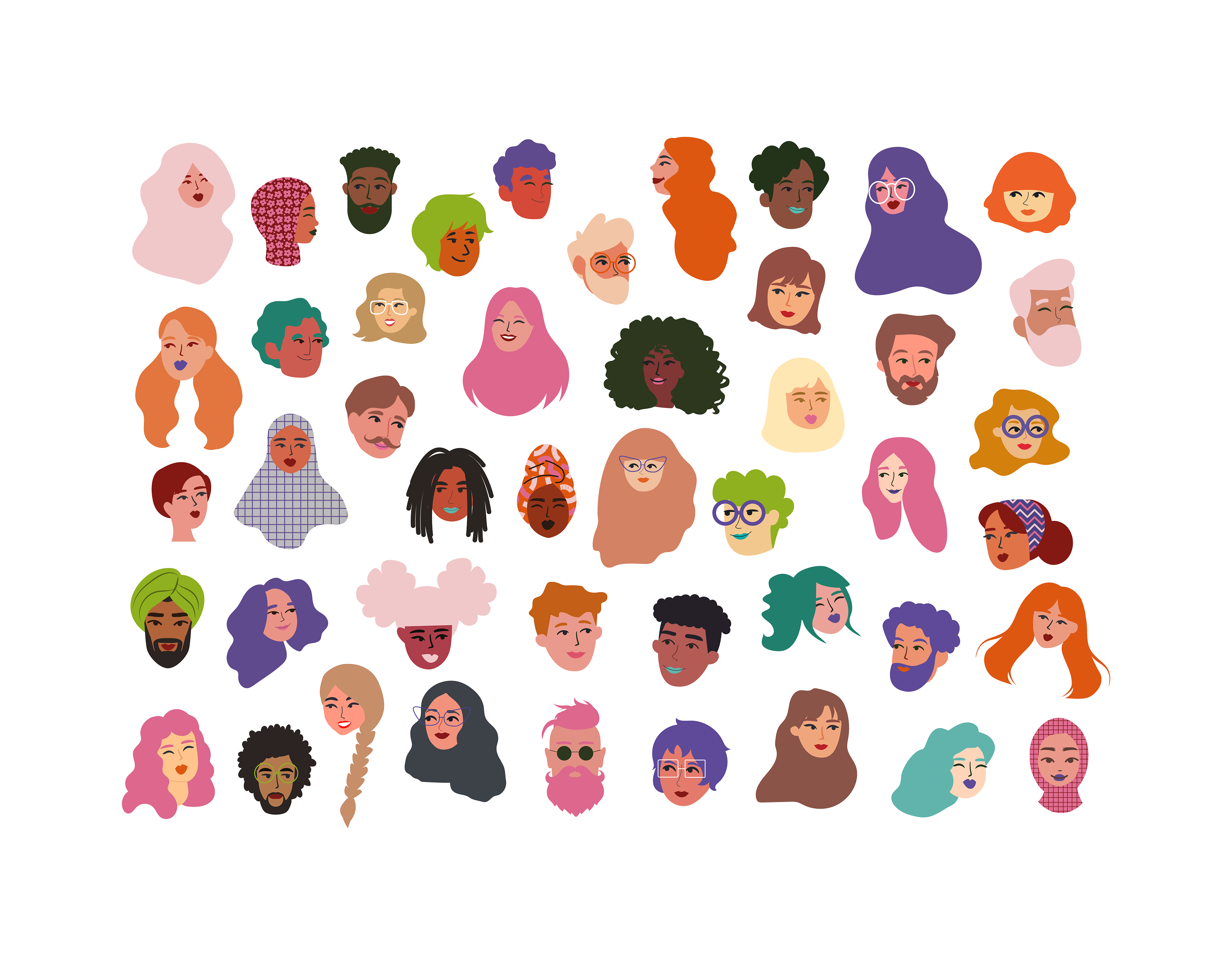
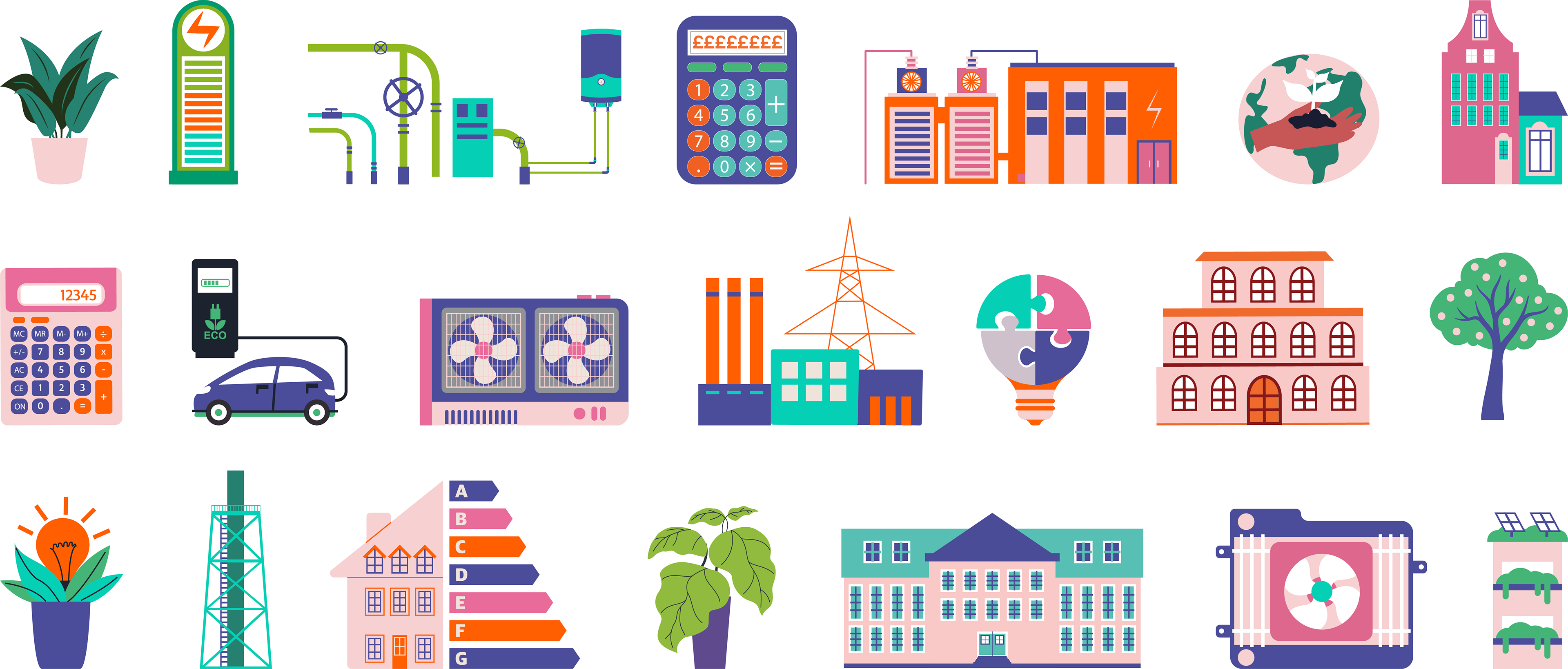
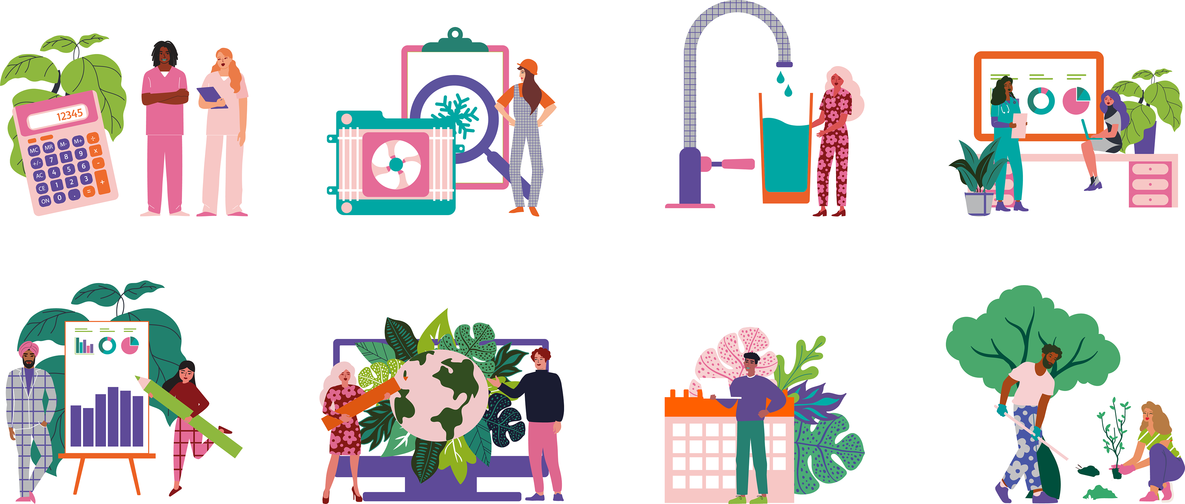
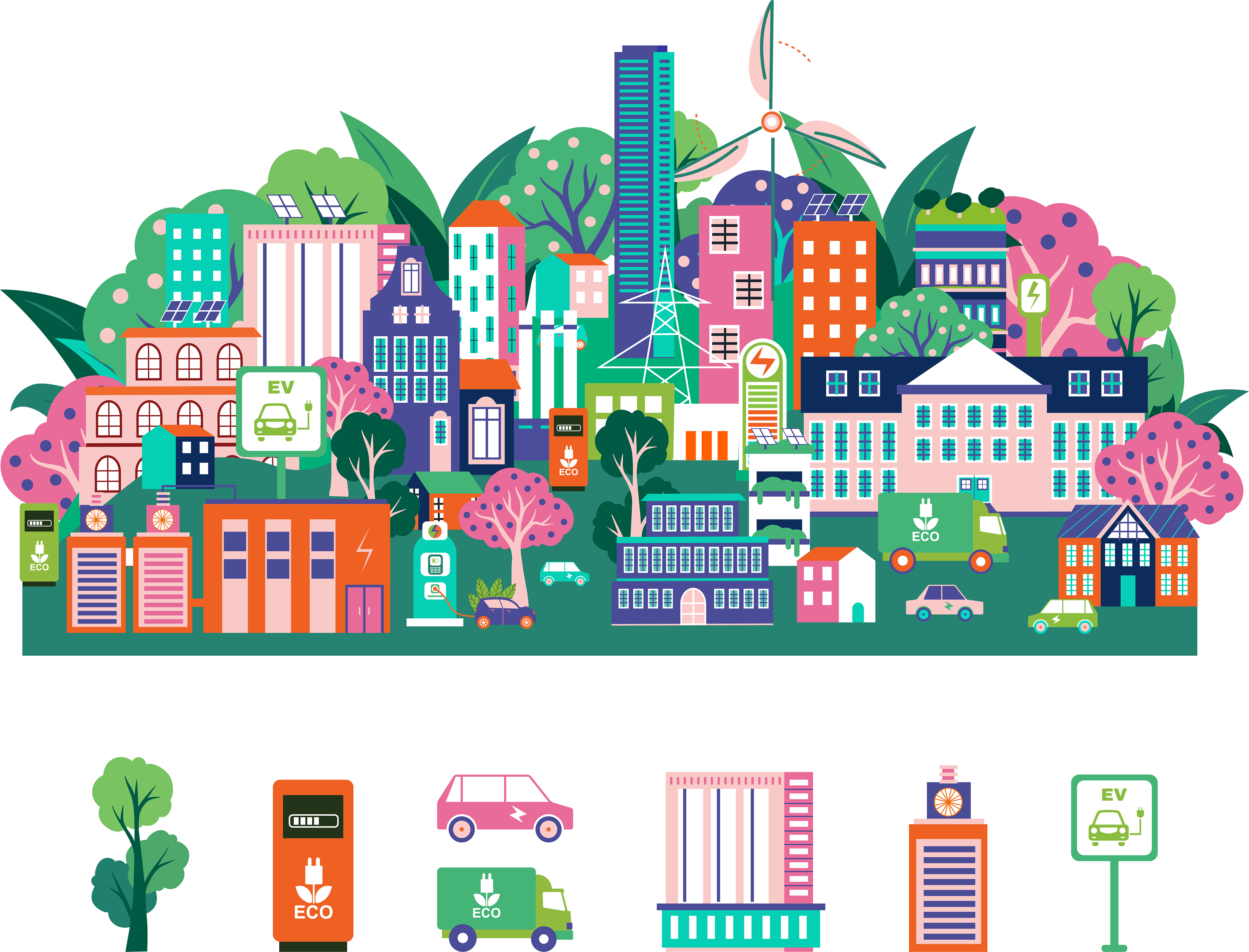
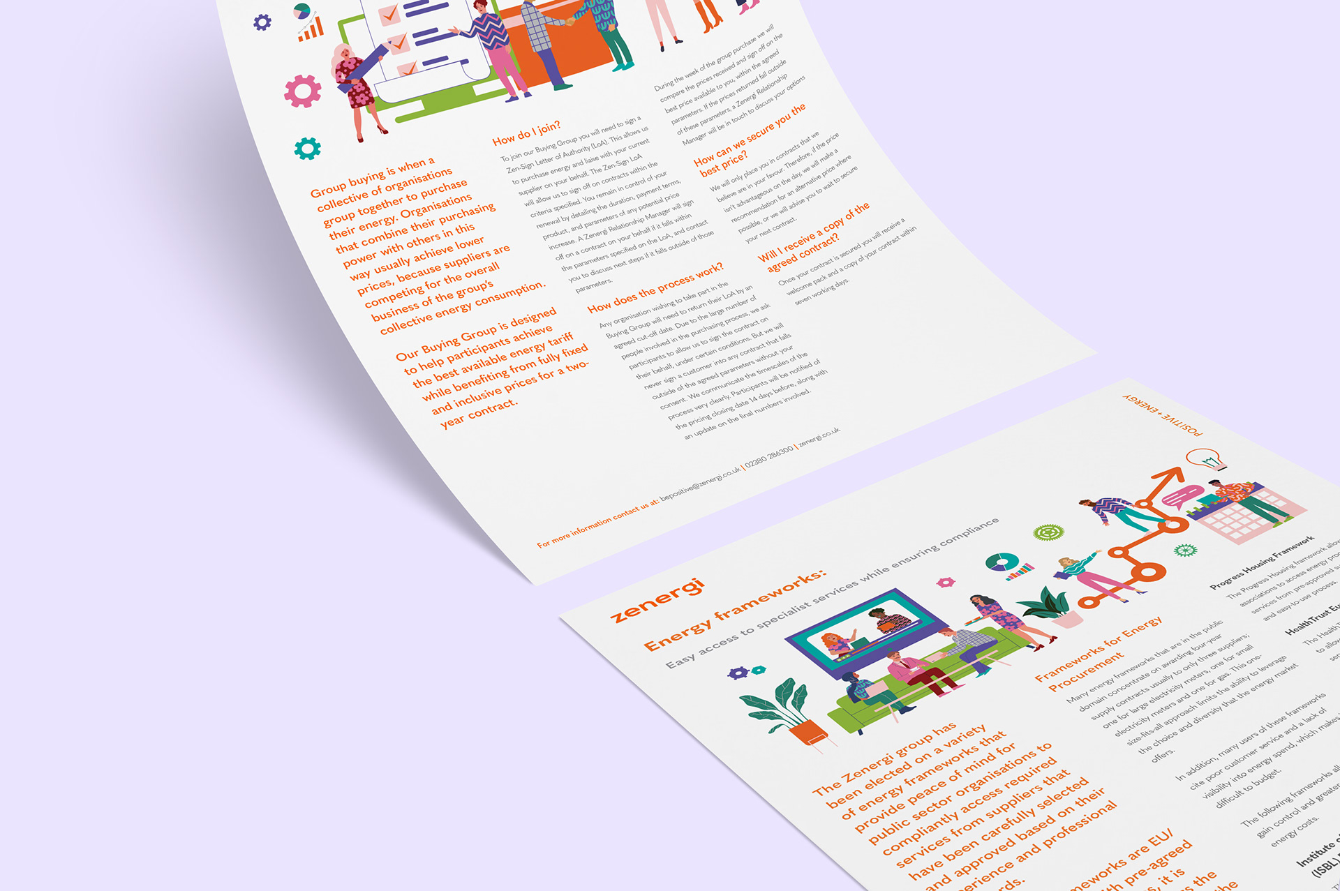
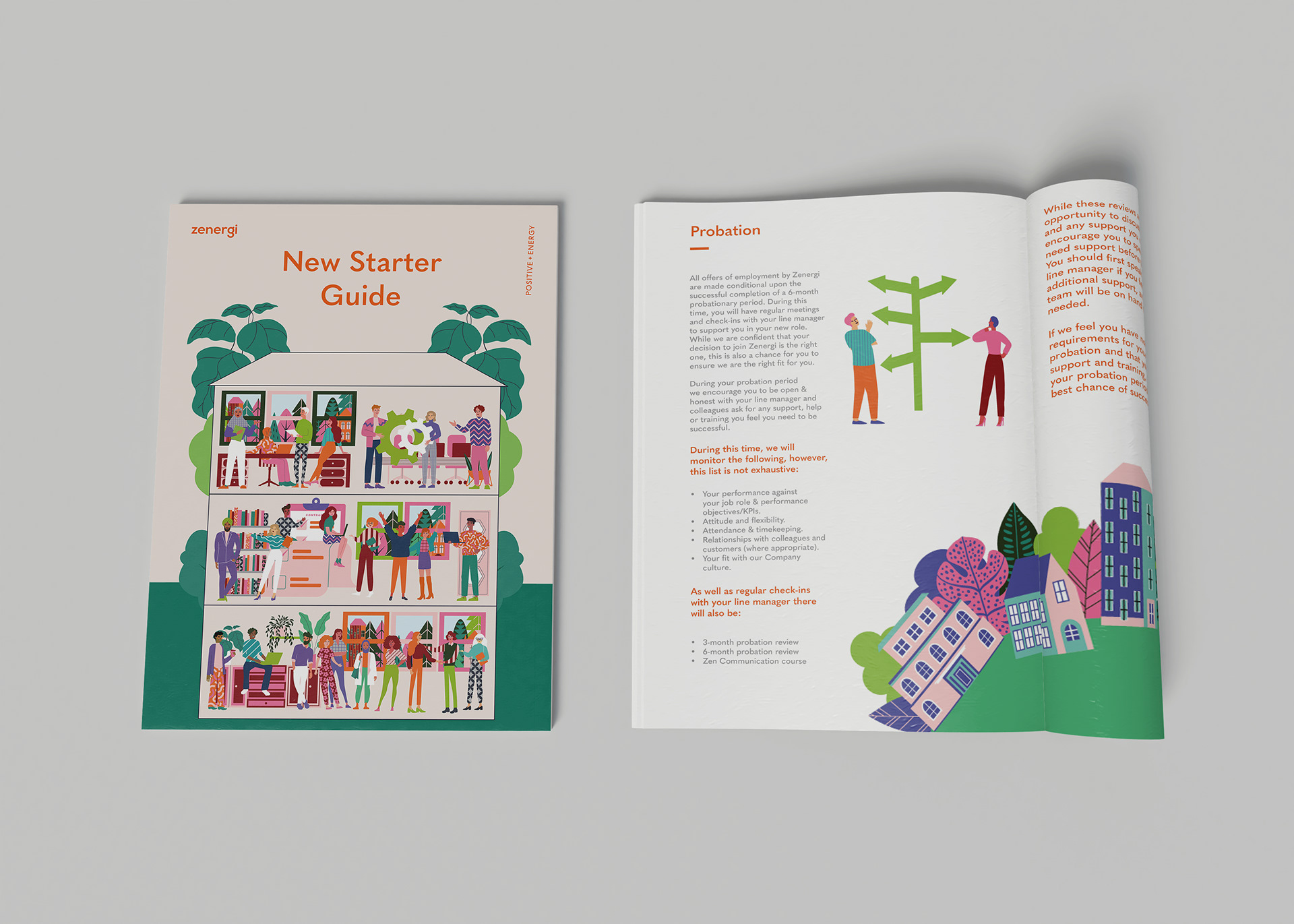
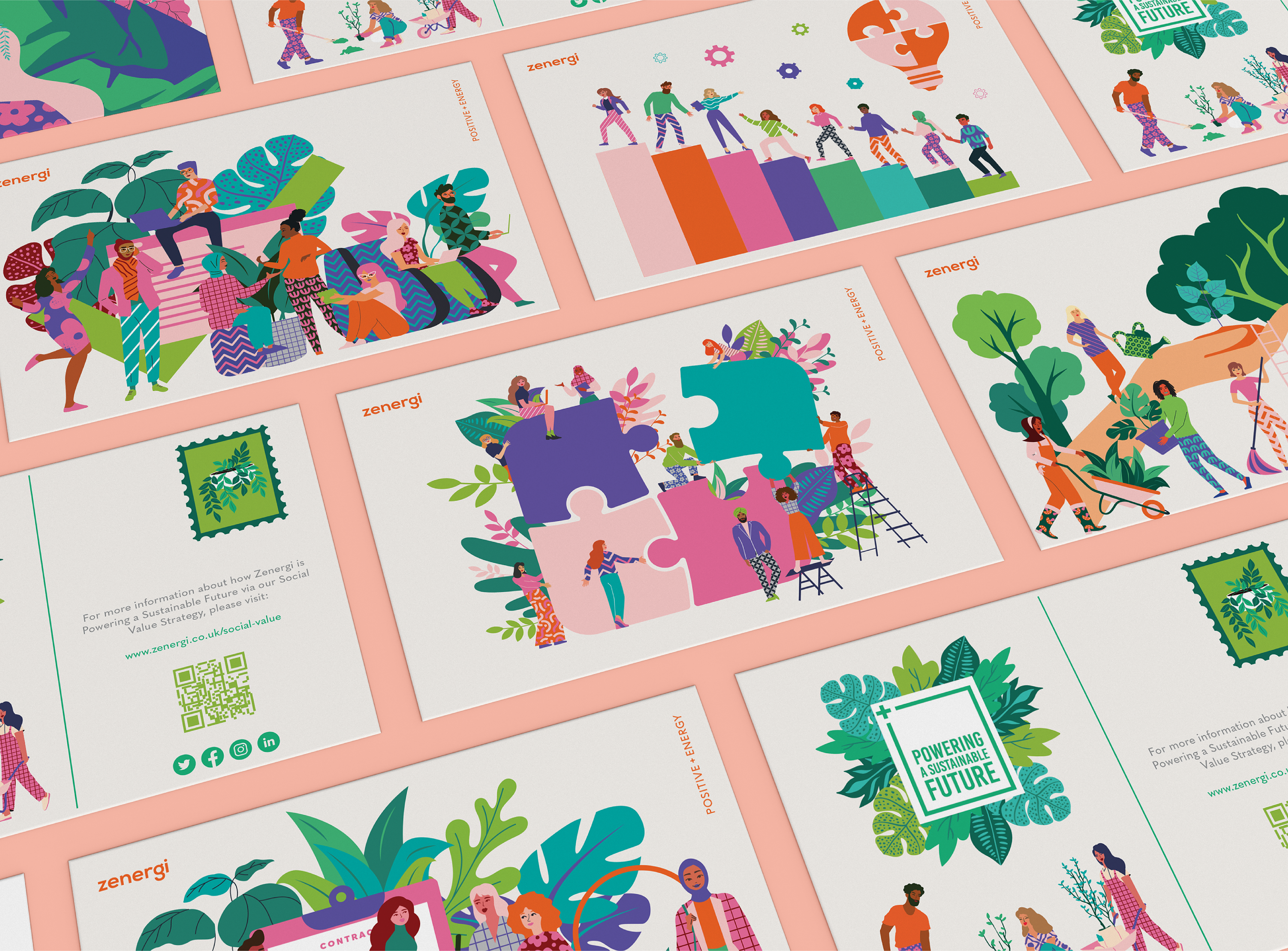
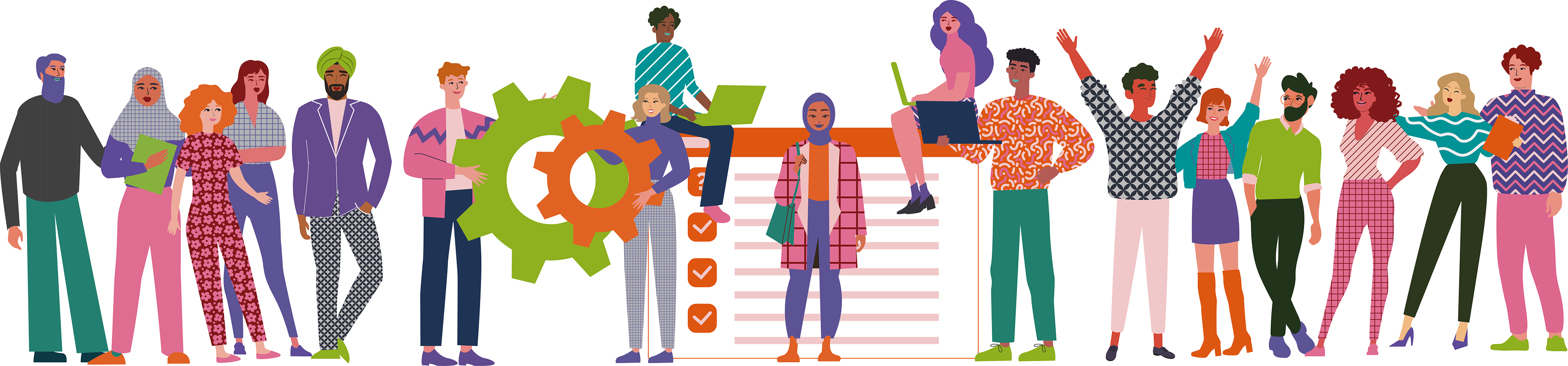
I created a flexible illustration system built around a growing library of reusable elements. This included characters, props, icons, and background details that could be combined and adapted to suit different contexts. Having a wide range of characters and outfits made it possible to create diverse illustrations representing different cultures and audiences. Alongside this, I developed spot illustrations to communicate single ideas clearly, helping simplify more abstract or technical concepts.
Zenergi previously relied on stock imagery, which limited how effectively complex ideas could be communicated and made it difficult to stand out. The visuals lacked personality and didn’t reflect the direction of the updated brand. Building on the new guidelines, I developed a bespoke illustration style designed to feel clear, consistent, and adaptable across different outputs. Research into other brands helped define an approach that balanced simplicity with character.
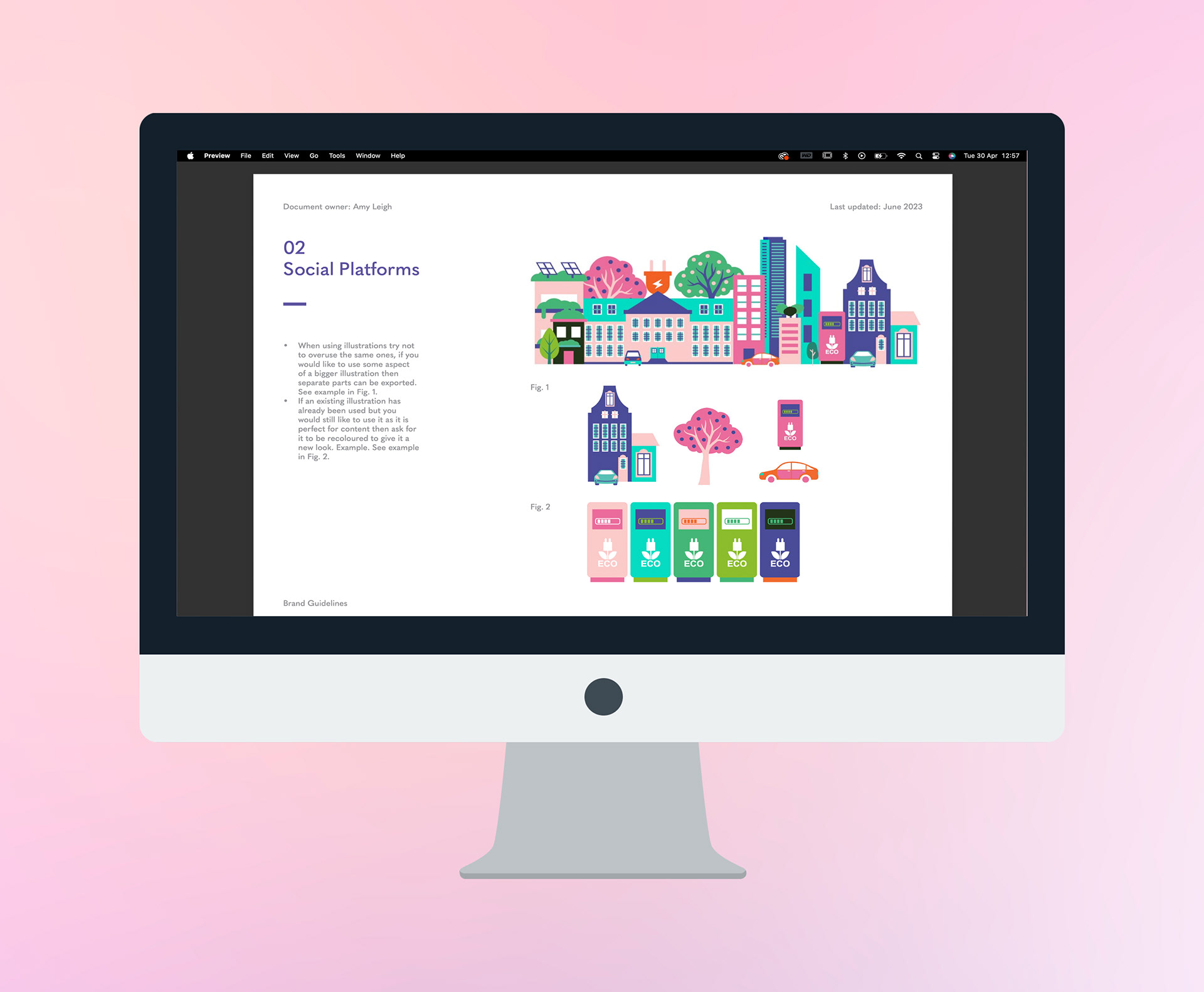
Each element was saved and organised so existing assets could be reused, recoloured, or recombined to create new illustrations quickly. This approach supported the needs of a busy marketing team, allowing new visuals to be created efficiently without starting from scratch.
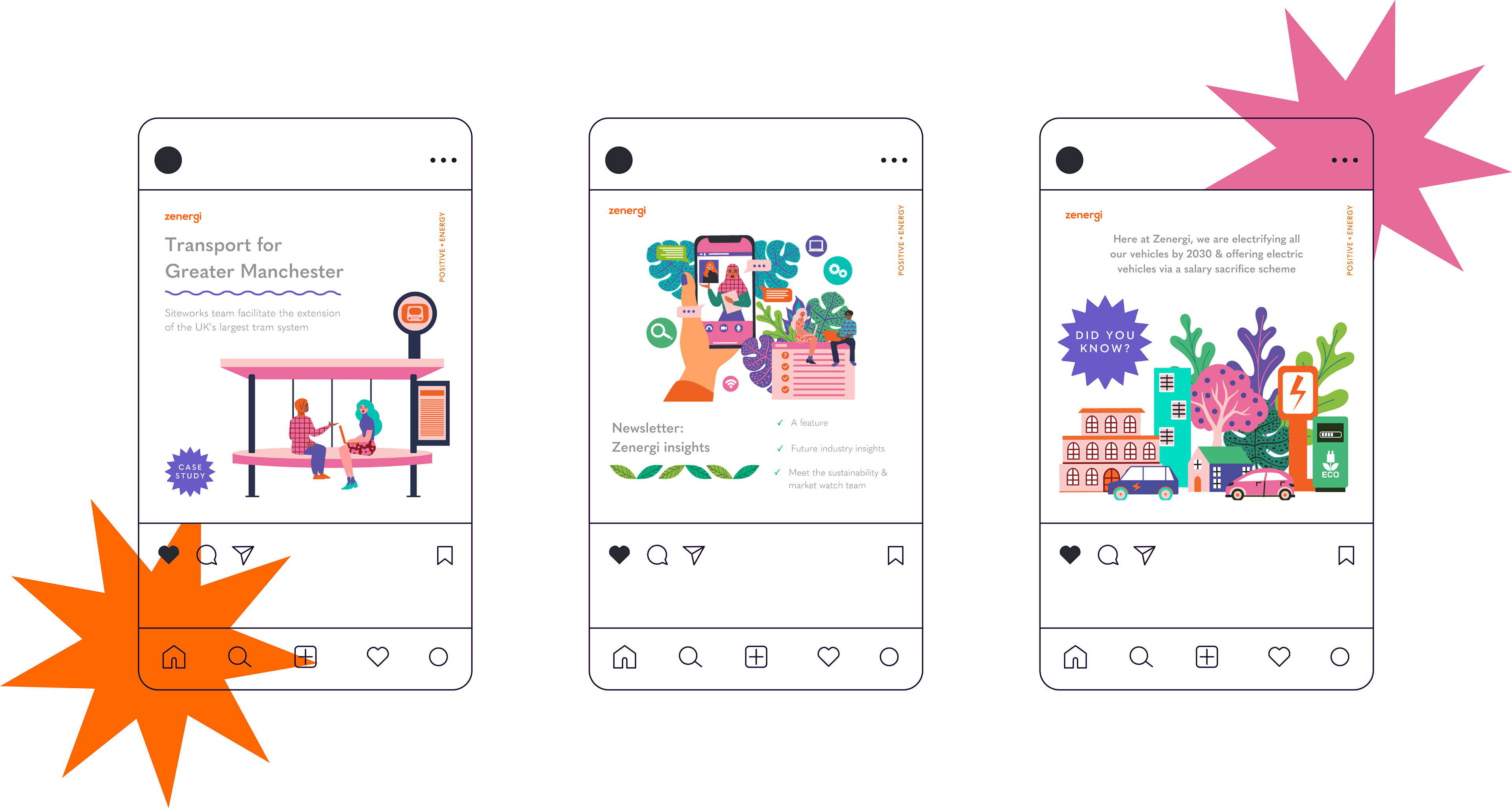
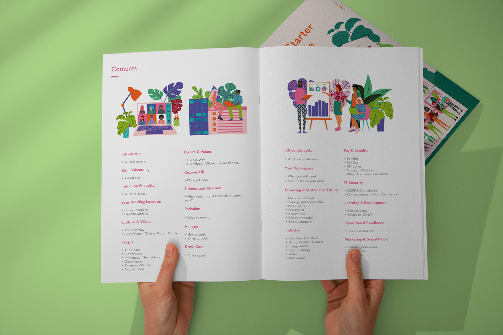
The modular system allowed teams to communicate ideas more visually, reducing reliance on dense text and improving accessibility. Over time, this grew into a scalable asset library used across marketing, presentations, and internal materials. The result is a more distinctive visual language that strengthens the brand and improves clarity across the business.
Zenergi previously relied on stock imagery, which limited how effectively complex ideas could be communicated and made it difficult to stand out. The visuals lacked personality and didn’t reflect the direction of the updated brand. Building on the new guidelines, I developed a bespoke illustration style designed to feel clear, consistent, and adaptable across different outputs. Research into other brands helped define an approach that balanced simplicity with character.
Each element was saved and organised so existing assets could be reused, recoloured, or recombined to create new illustrations quickly. This approach supported the needs of a busy marketing team, allowing new visuals to be created efficiently without starting from scratch.
The modular system allowed teams to communicate ideas more visually, reducing reliance on dense text and improving accessibility. Over time, this grew into a scalable asset library used across marketing, presentations, and internal materials. The result is a more distinctive visual language that strengthens the brand and improves clarity across the business.