Zenergi & Briar
Product Sheets
-
Simplifying content so key information isn’t lost.
Product Sheets
-
Simplifying content so key information isn’t lost.

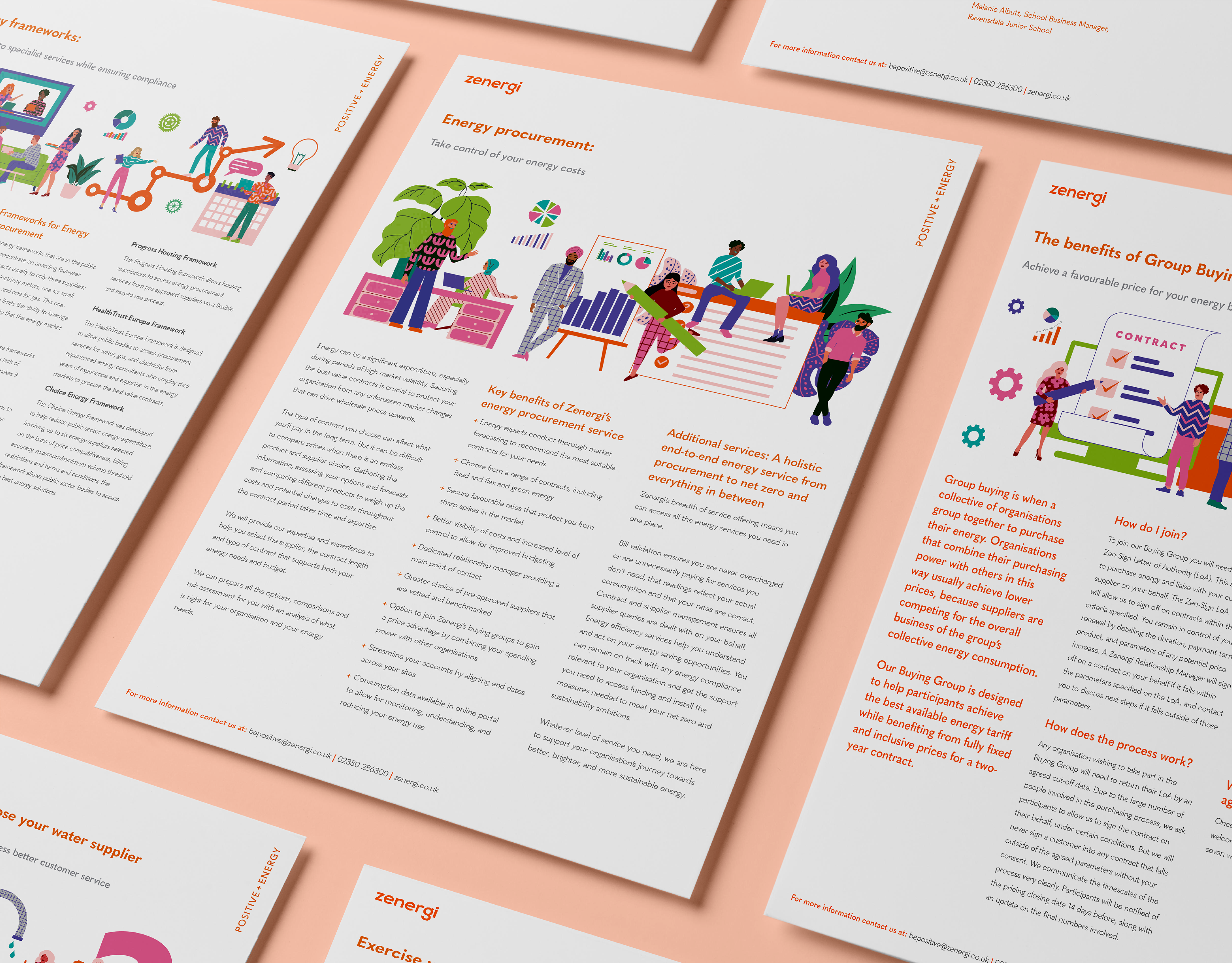
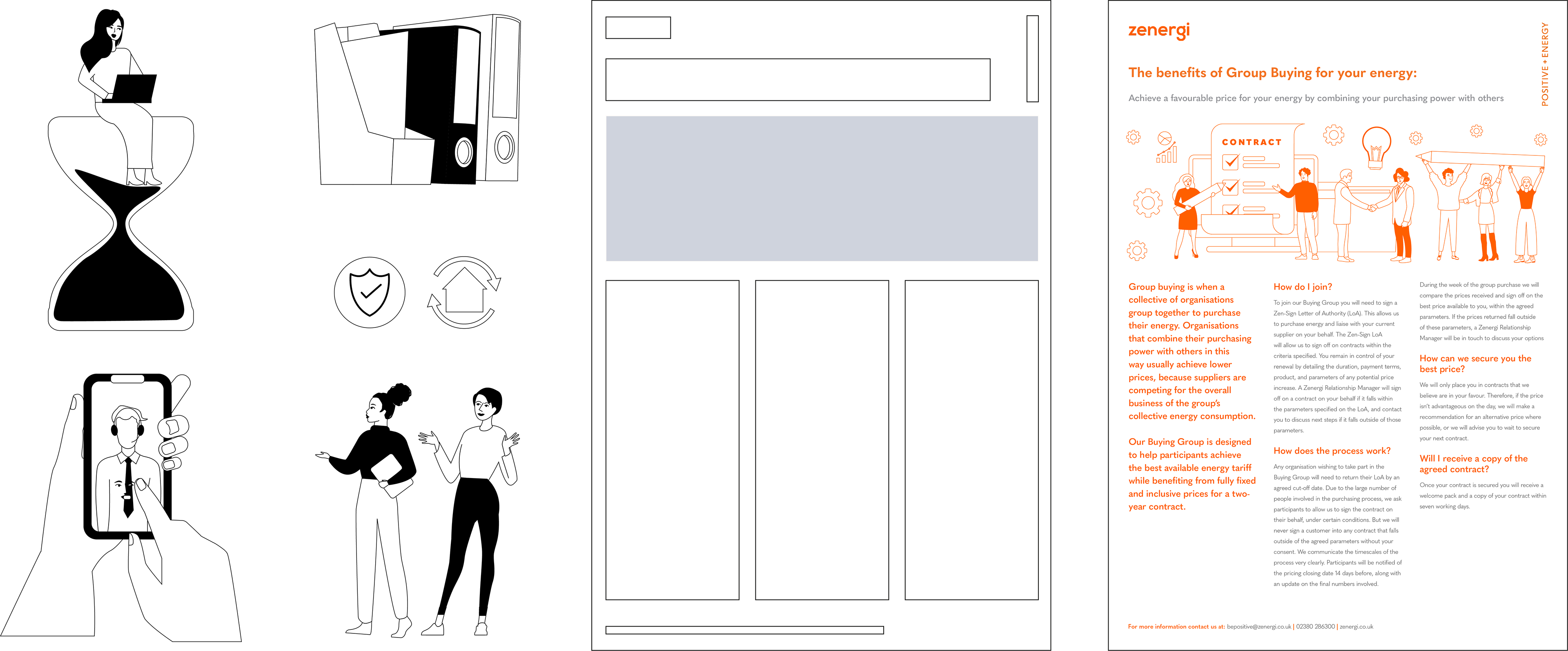
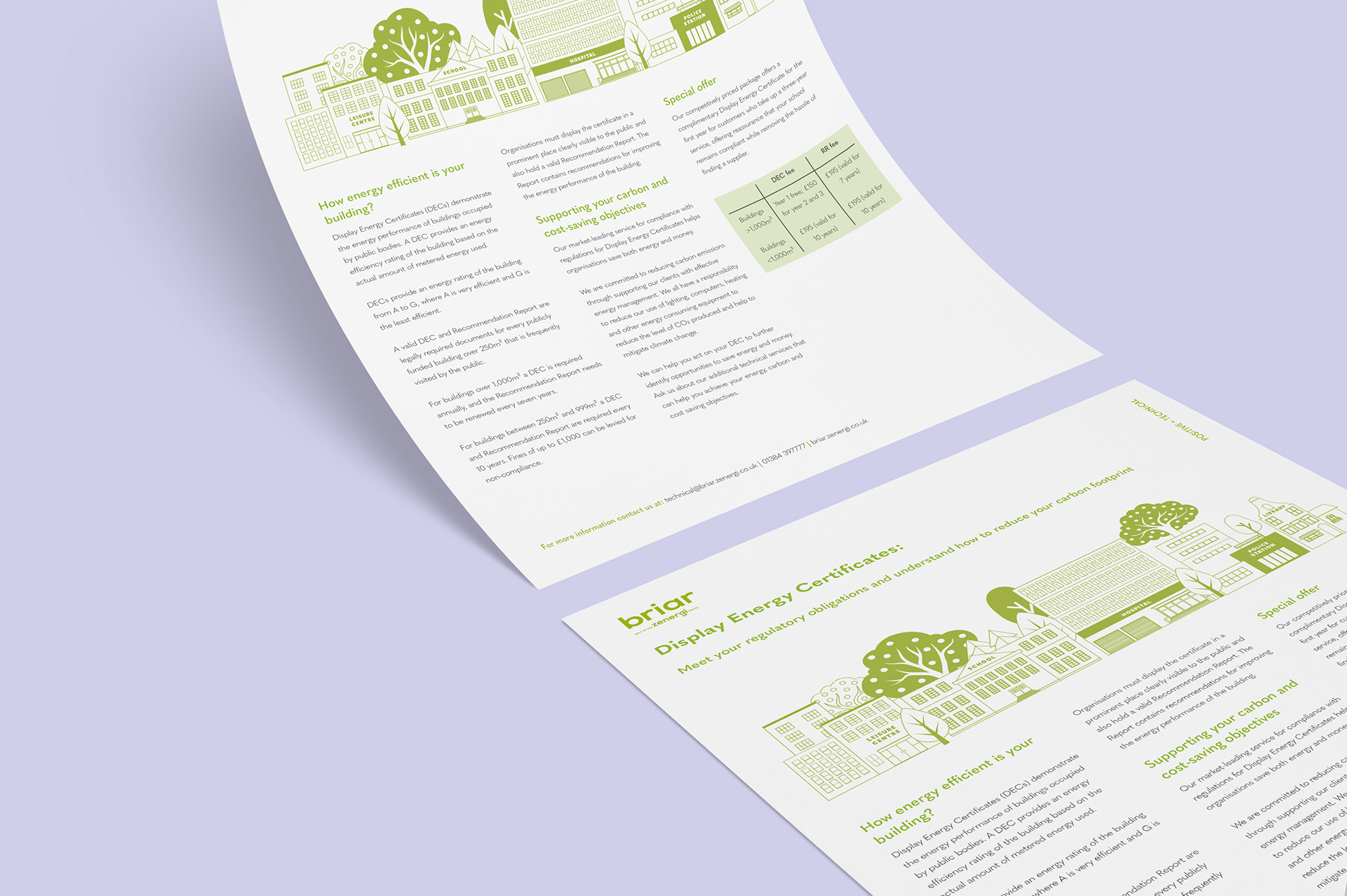
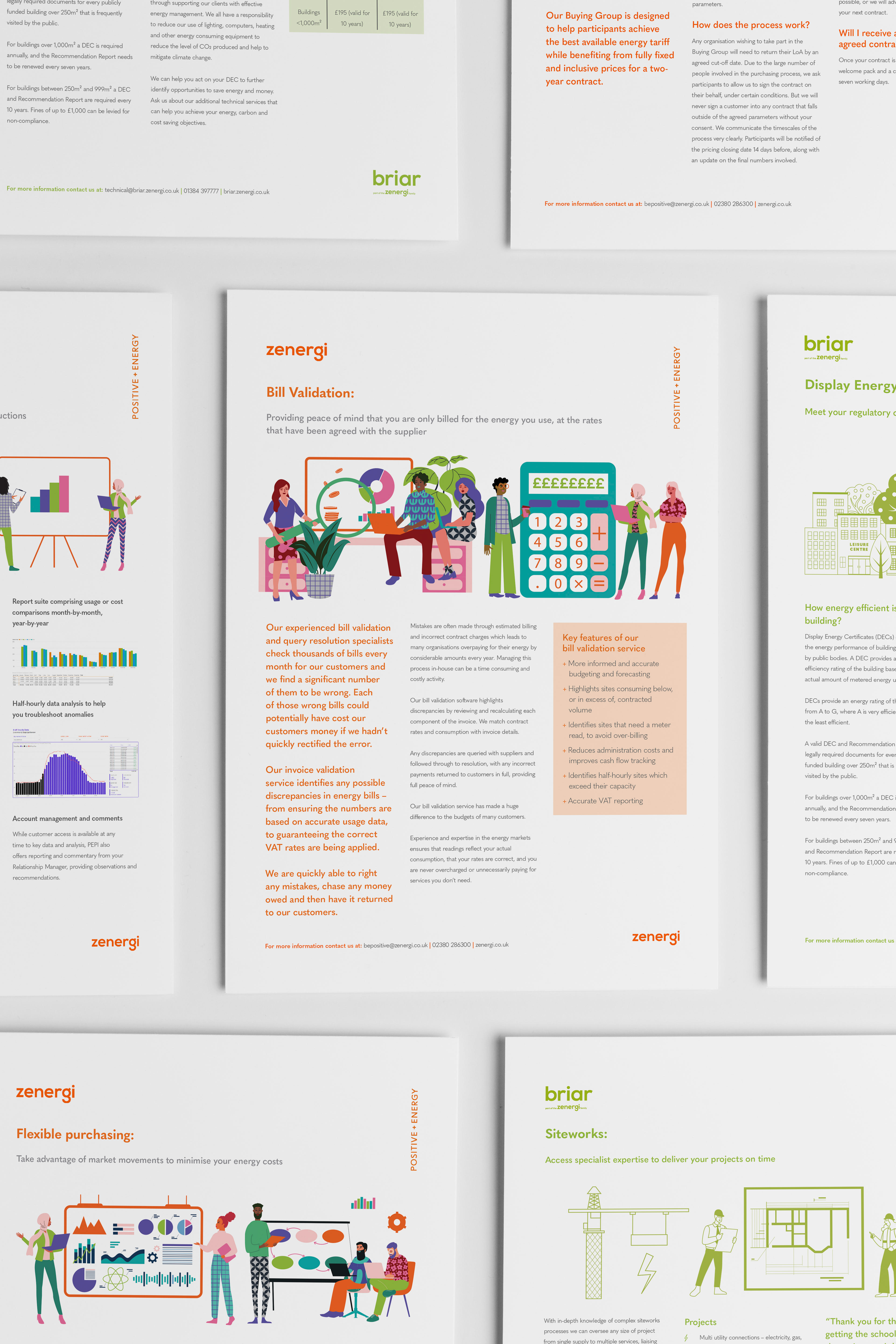
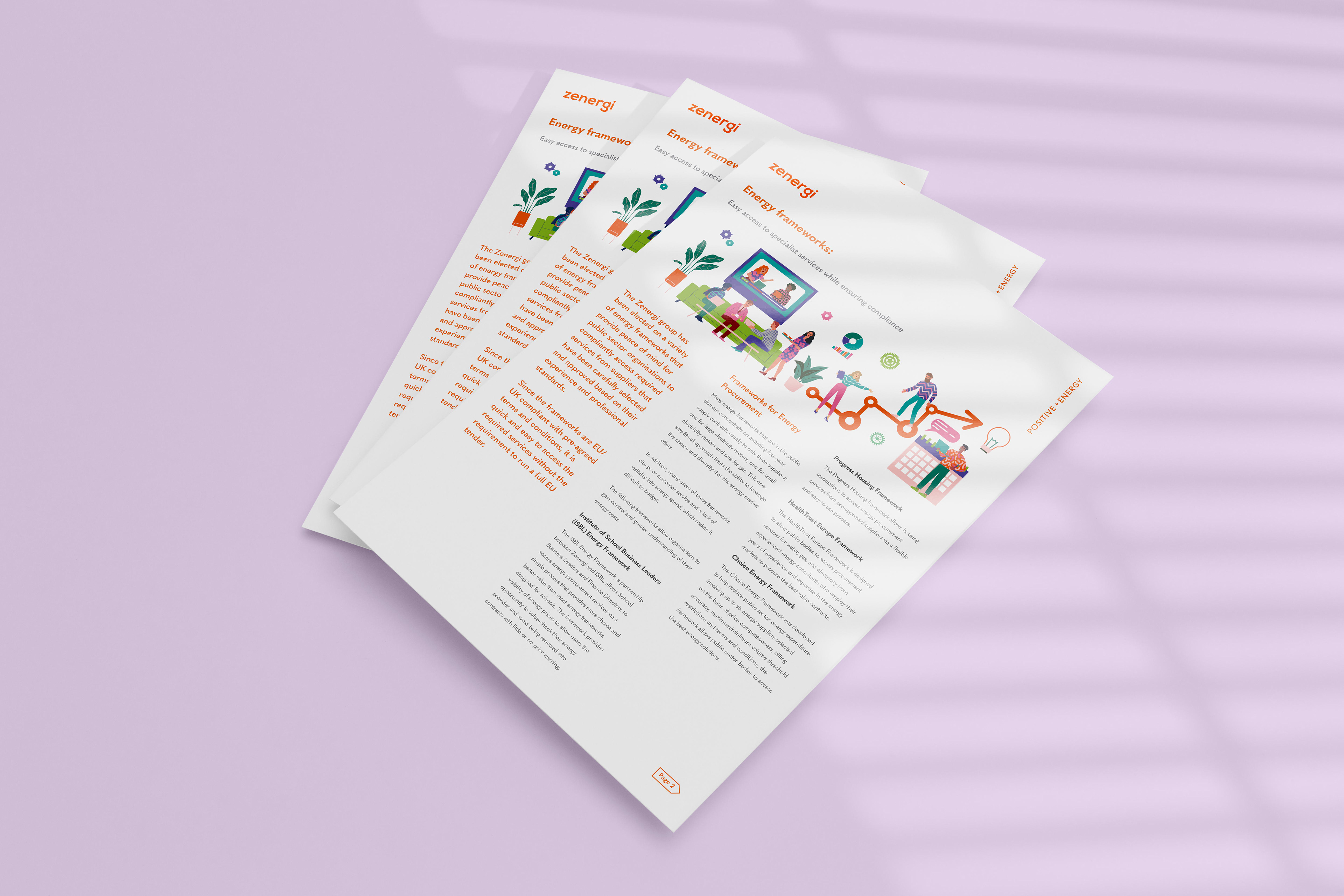
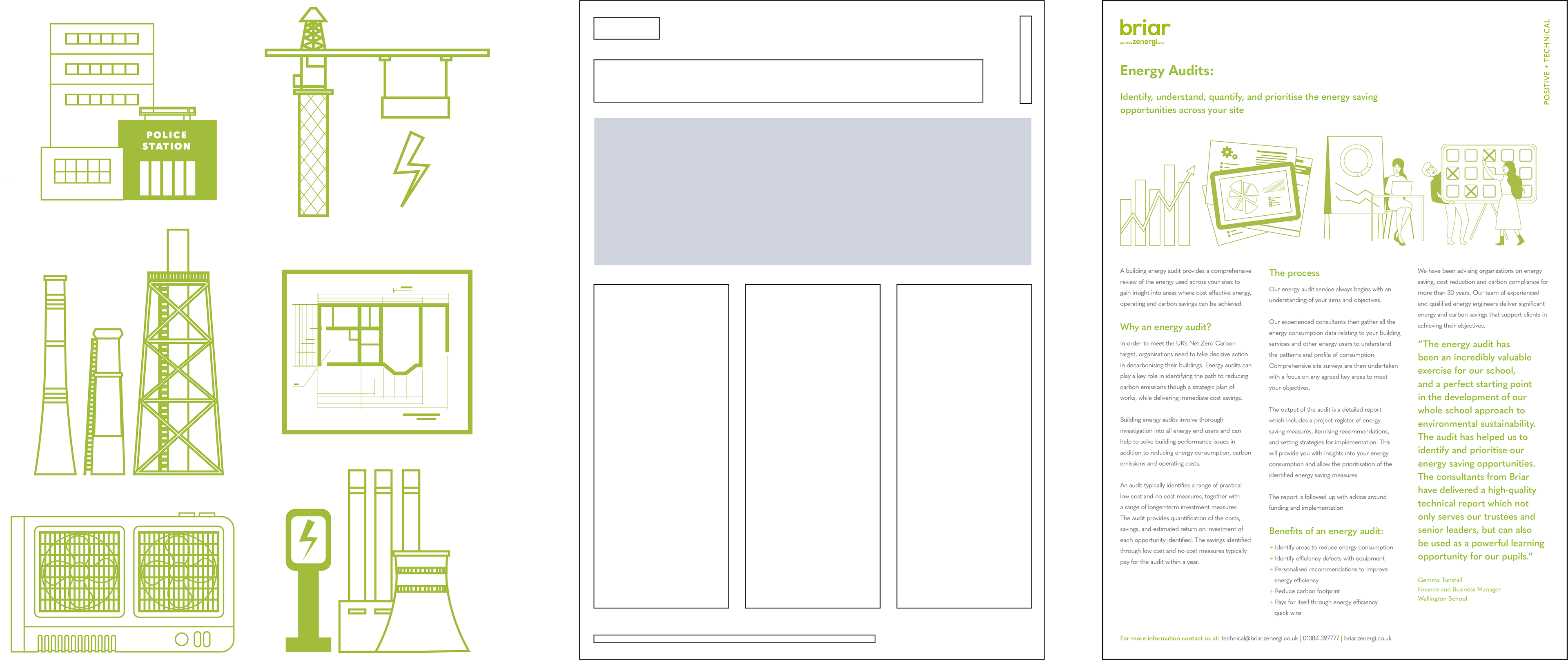
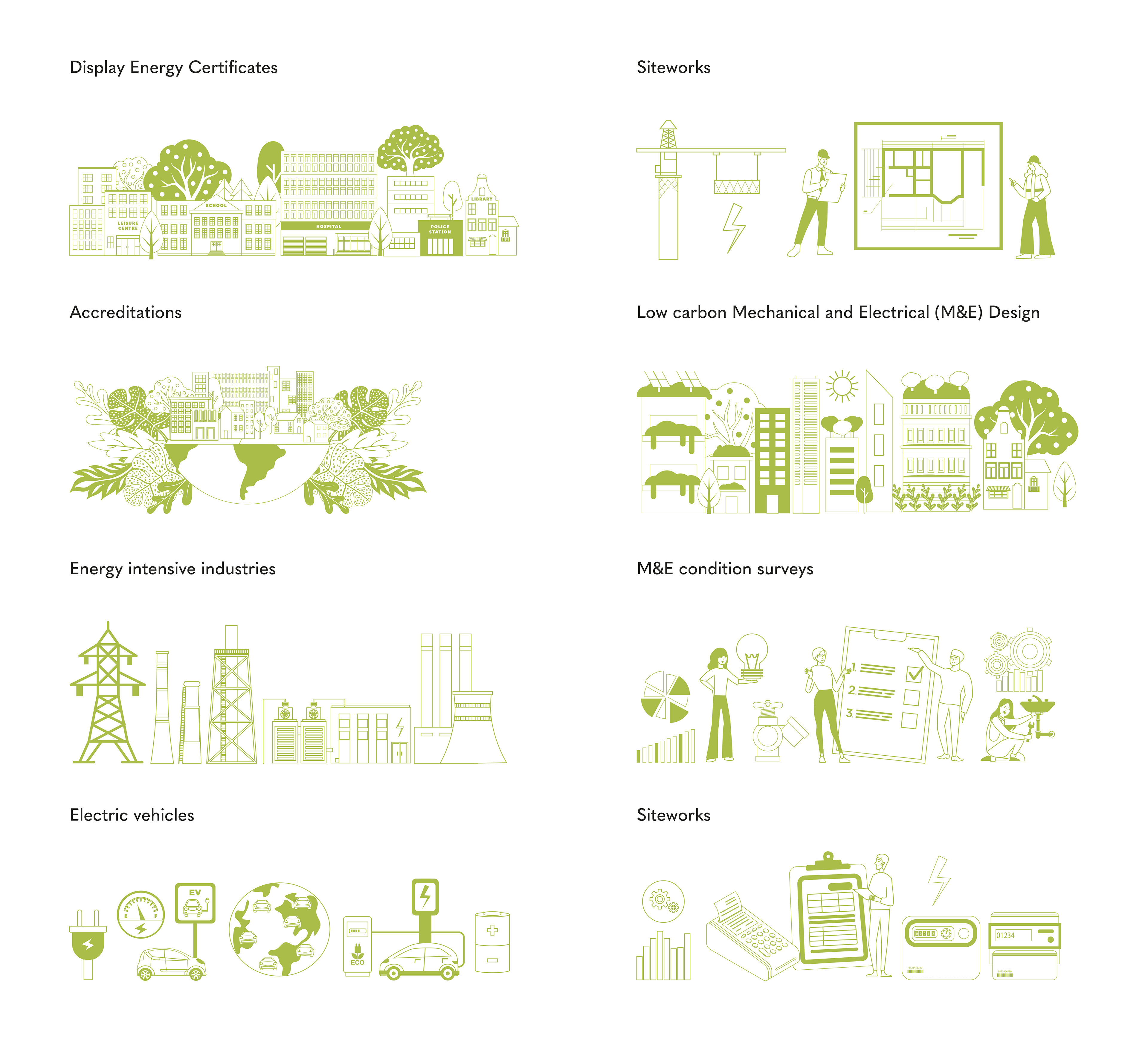
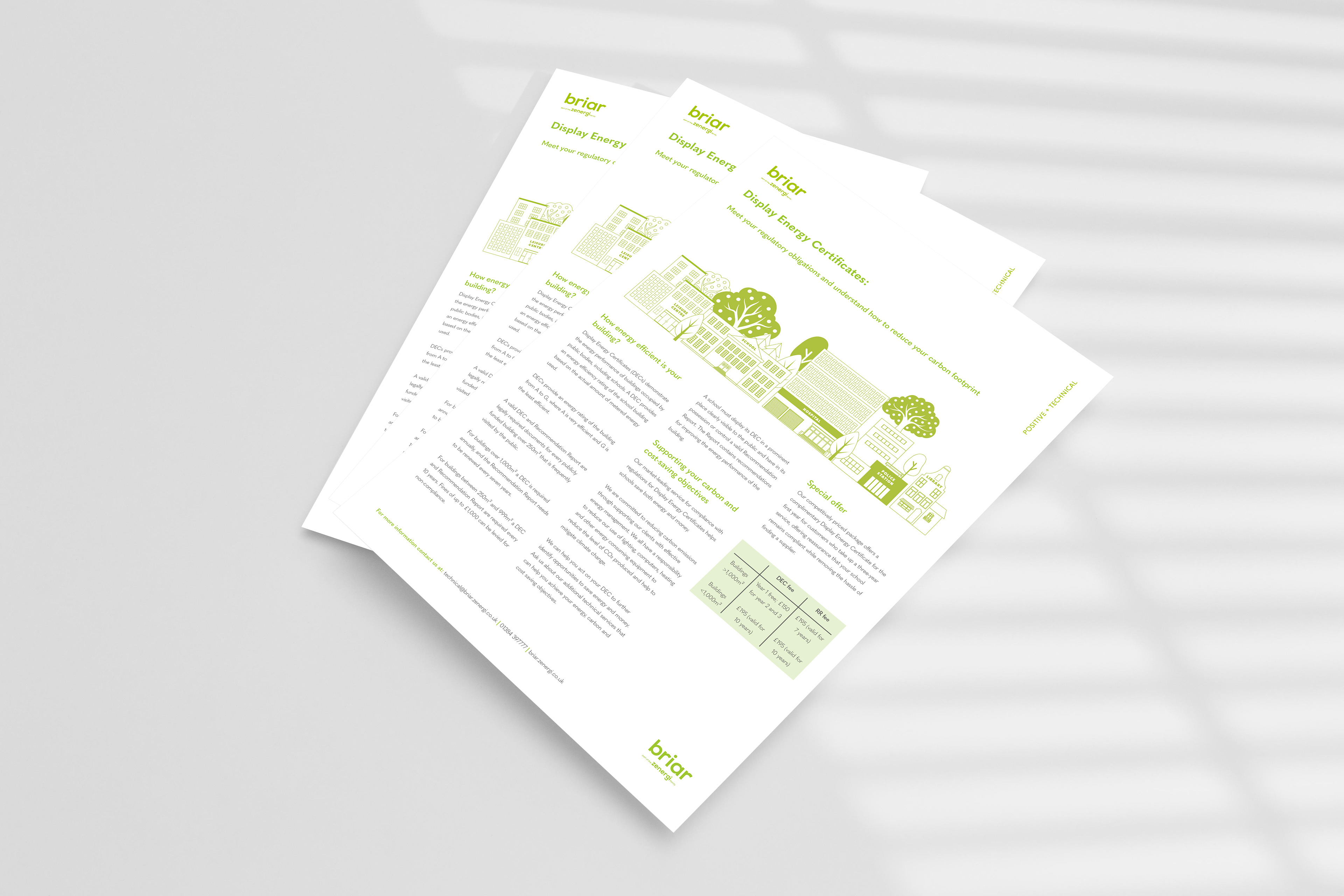
The original product sheets were cluttered and inconsistent, making key information difficult to find, especially in busy conference settings.
I introduced a three-column grid to improve structure and control line length, creating a clearer hierarchy and more space for key points to stand out. Copy was refined to remove unnecessary detail and make each sheet easier to scan.
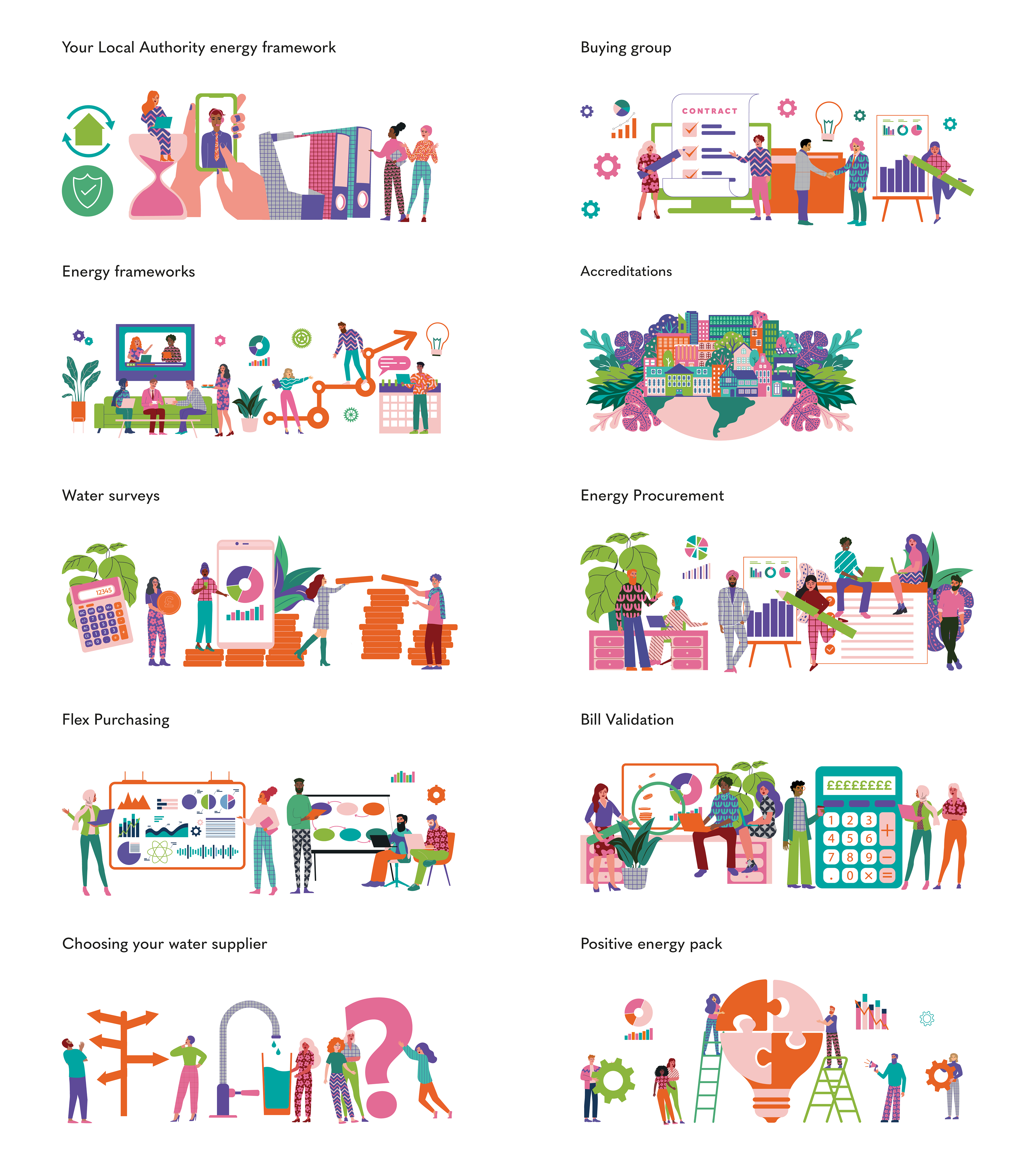
For Zenergi, bespoke illustrations replaced stock imagery to create a more recognisable visual style. For Briar, the system was adapted to a more minimal, single-colour approach while maintaining a connection to the parent brand. The updated layouts feel more considered and support clearer communication in both sales and marketing contexts.