Zenergi
Conference banners
-
Making the brand easier to use without losing consistency.
Conference banners
-
Making the brand easier to use without losing consistency.
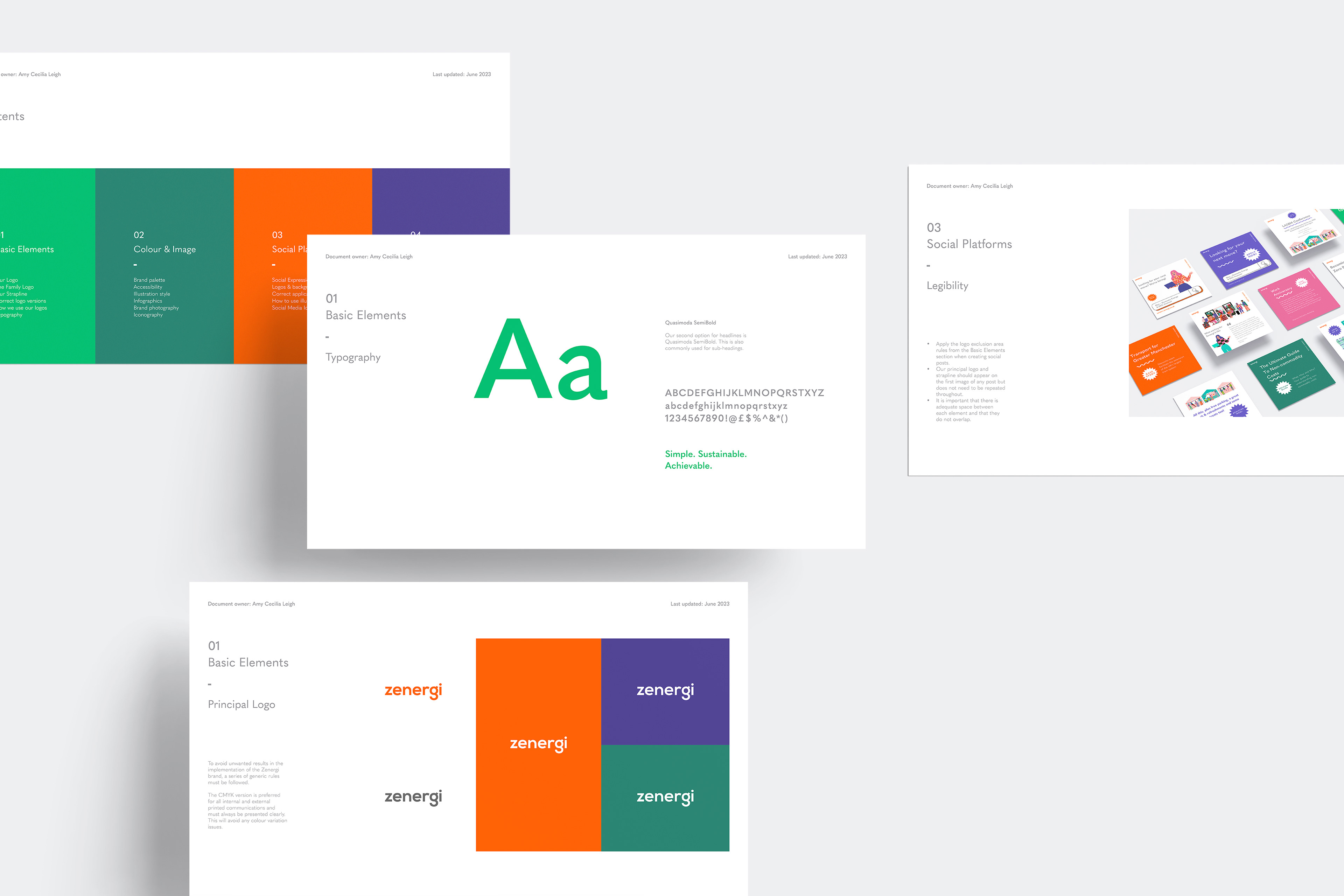
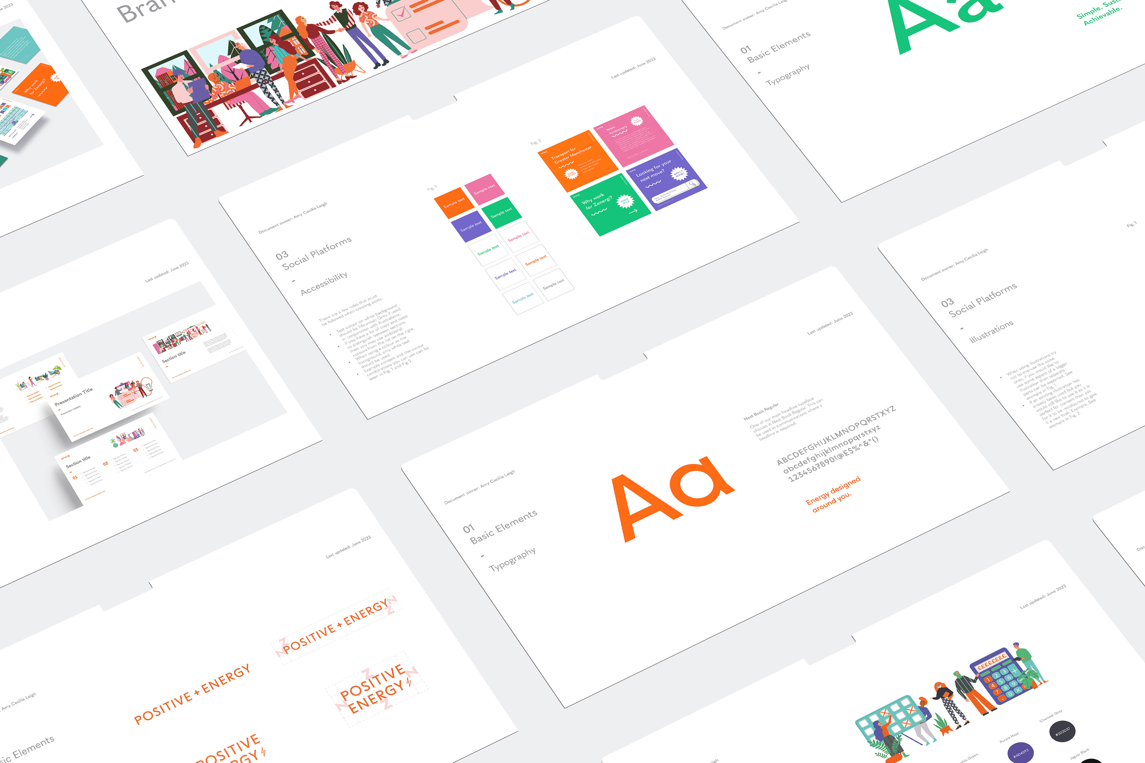
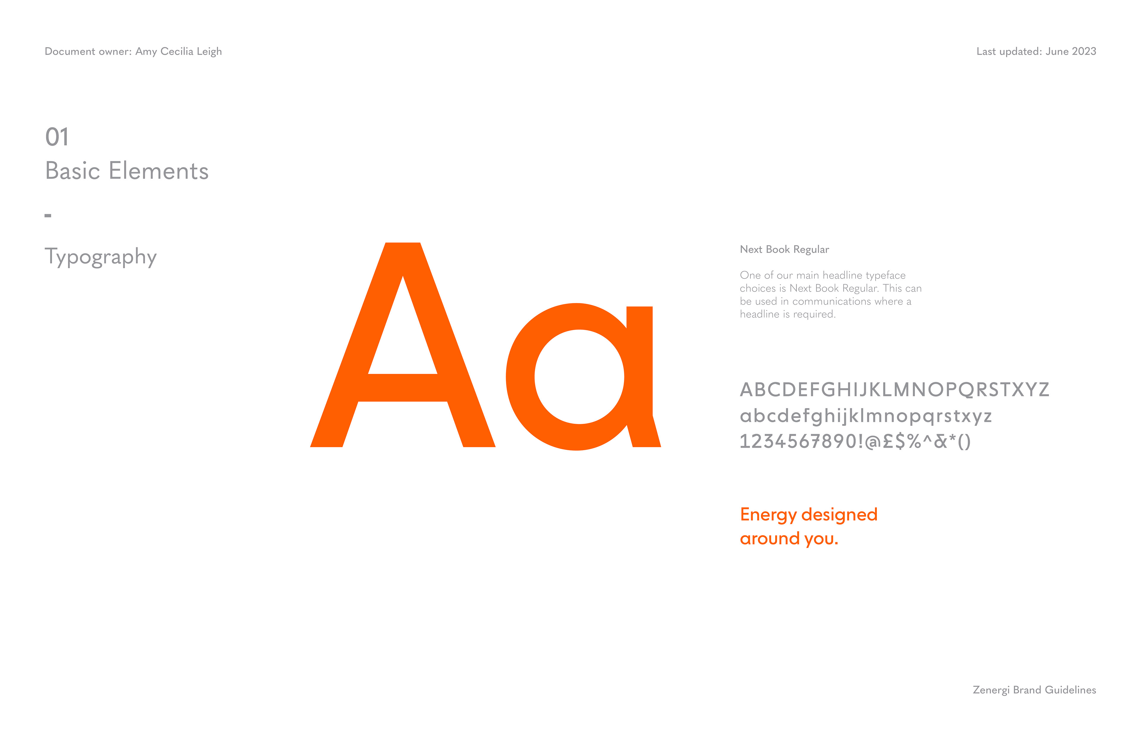
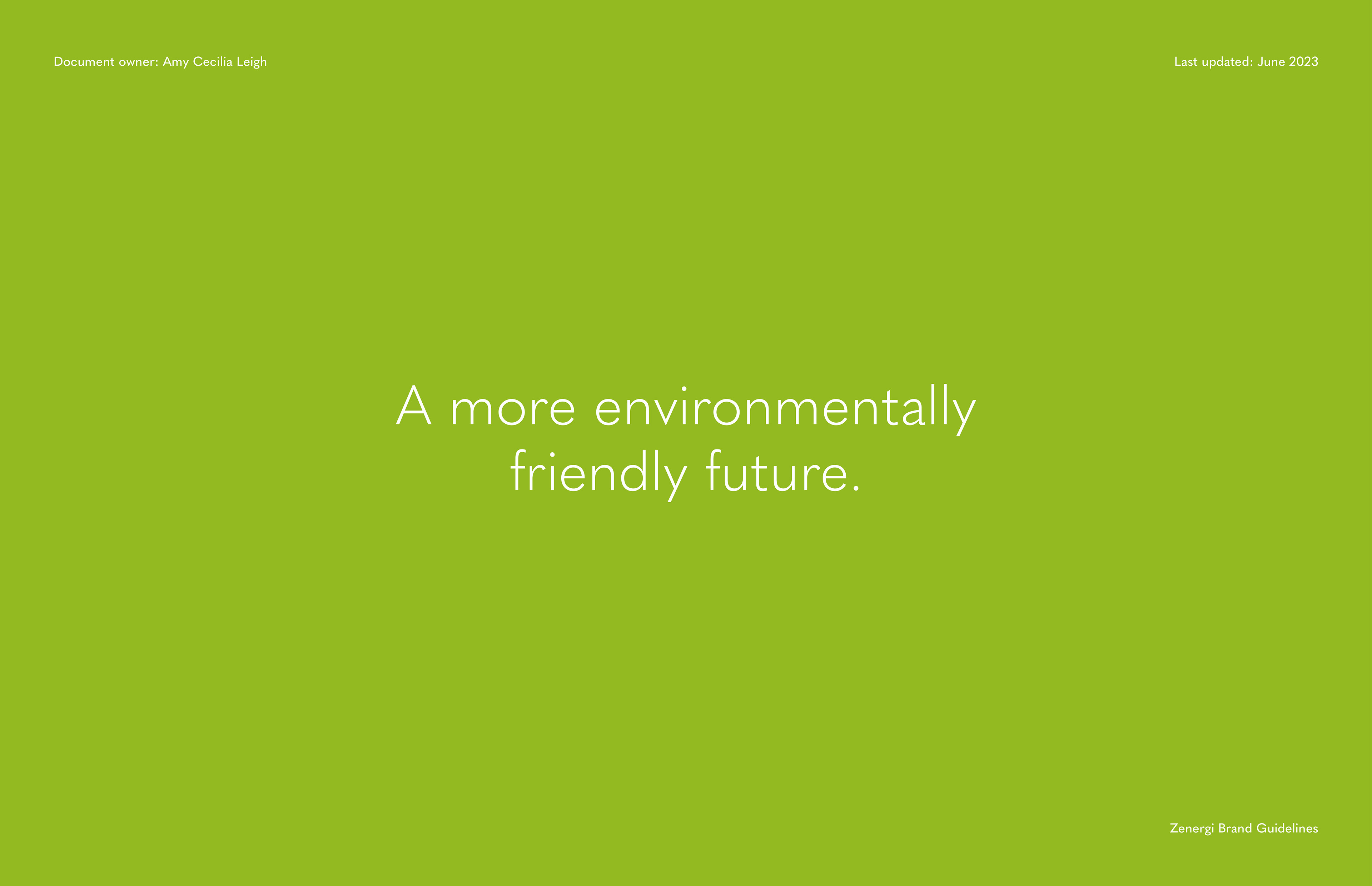
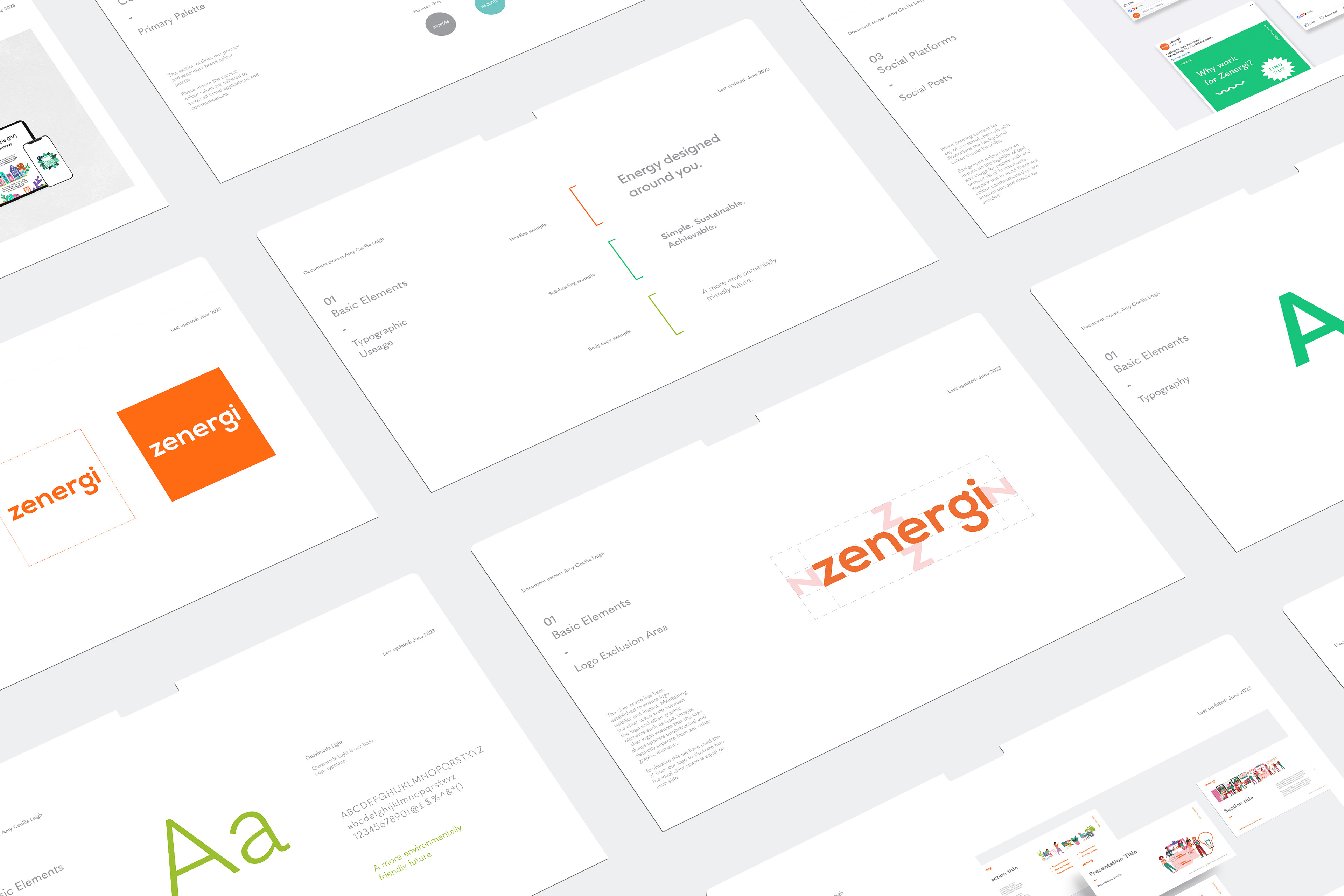
Zenergi’s existing brand guidelines were limited and overly rigid, making it difficult to create visually engaging work. A restricted colour palette, with no clear rules for combination or hierarchy, often resulted in poor legibility and inconsistent outputs across teams. The work also lacked distinction, with many assets resembling competitors.
I led the development of an updated brand system, focusing on creating a balance between consistency and creative flexibility. This involved researching competitor and cross-industry brands, running internal workshops, and developing multiple palette options based on brand values and team feedback.
I led the development of an updated brand system, focusing on creating a balance between consistency and creative flexibility. This involved researching competitor and cross-industry brands, running internal workshops, and developing multiple palette options based on brand values and team feedback.
The focus was on usability for Zenergi employees as much as design, so creating a document that teams could confidently apply in day-to-day work was key.
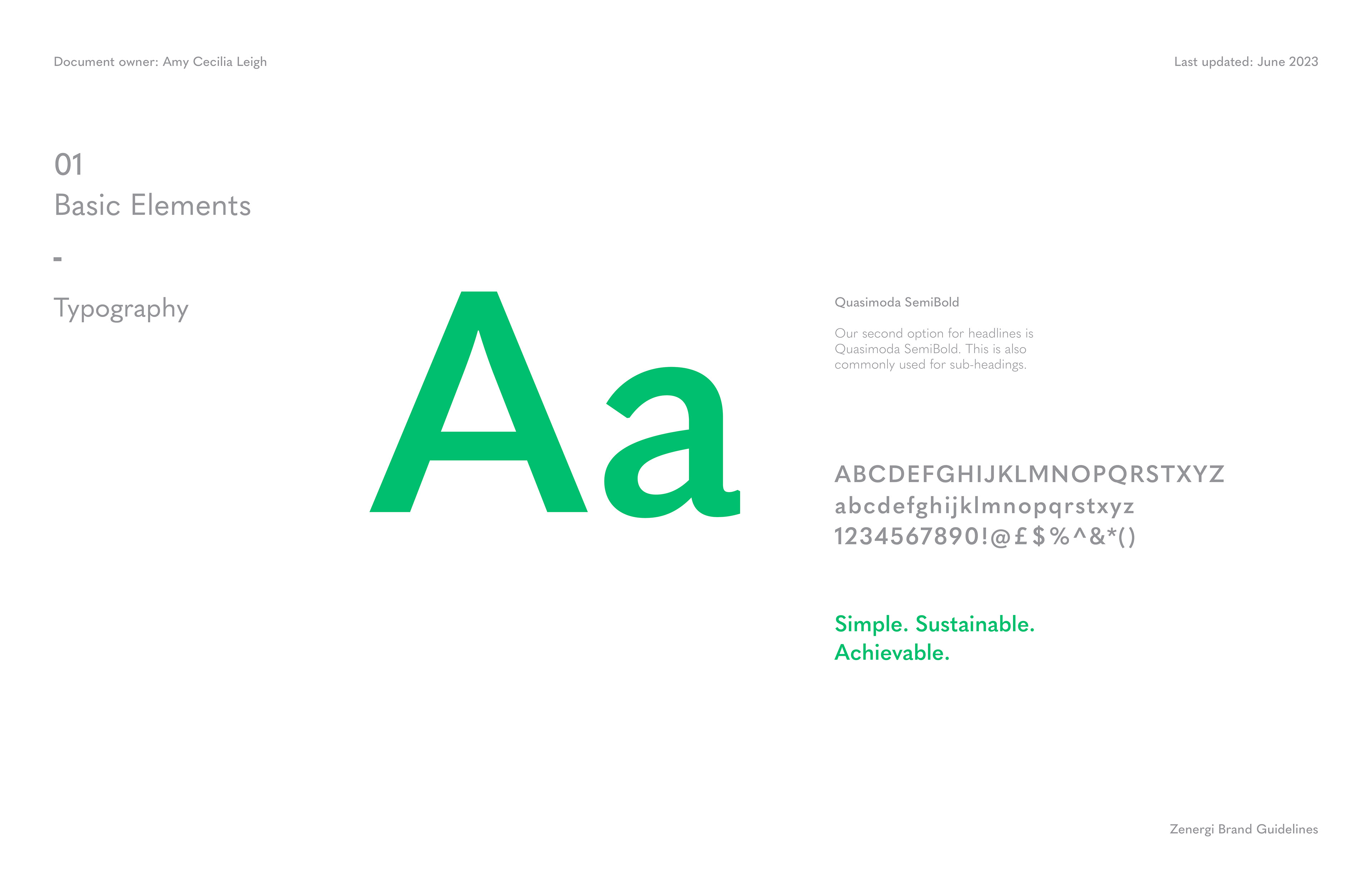
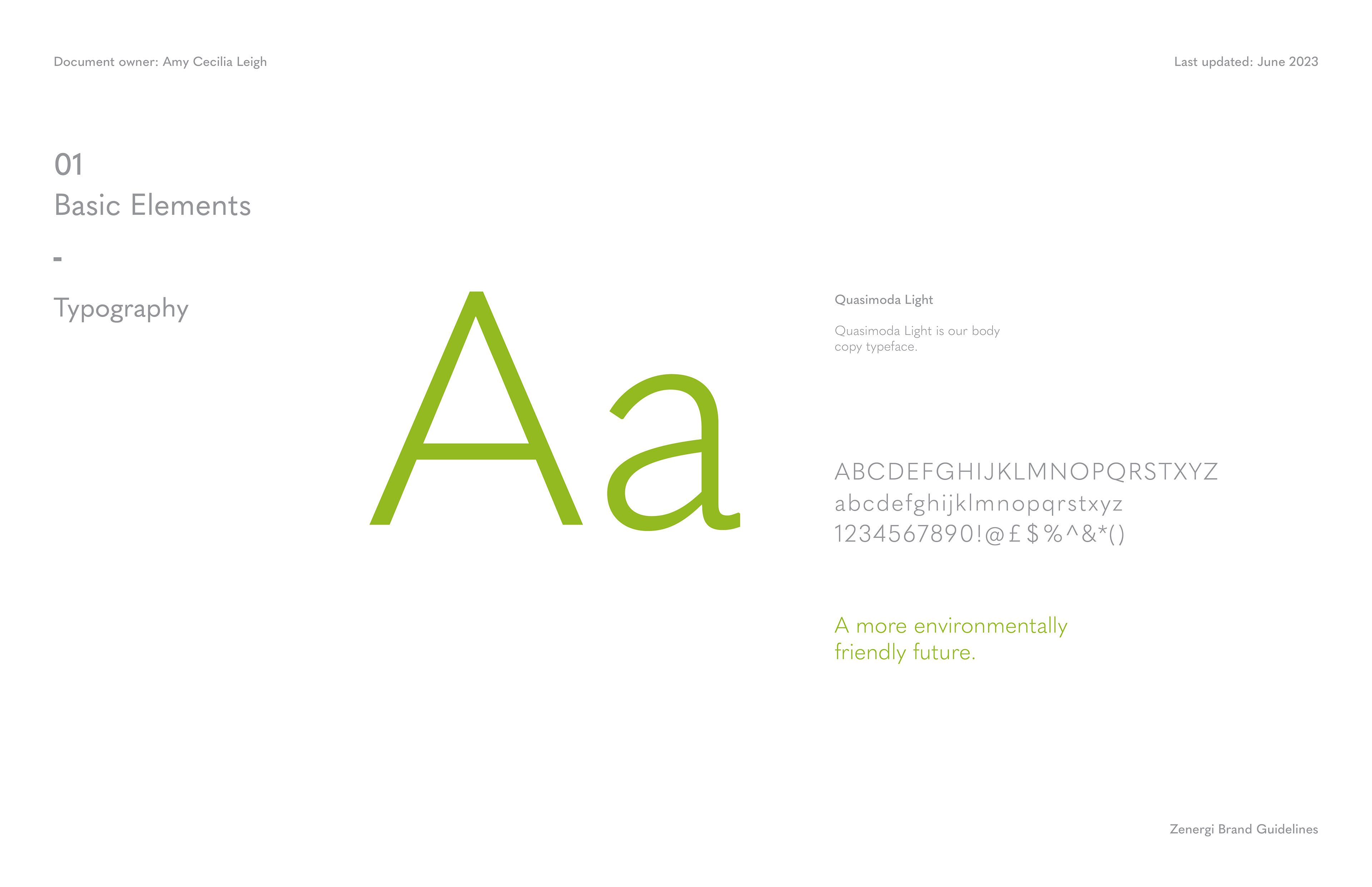
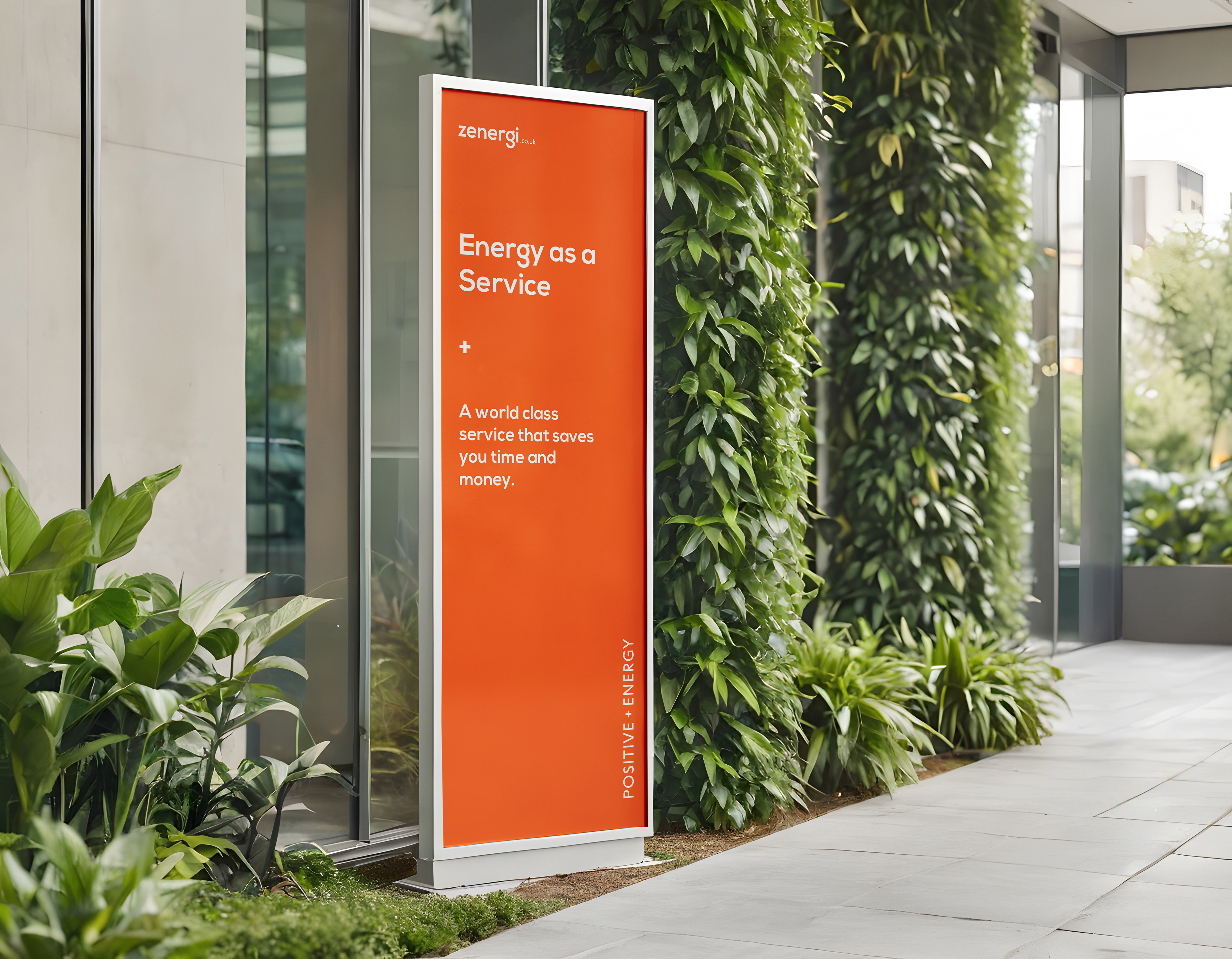
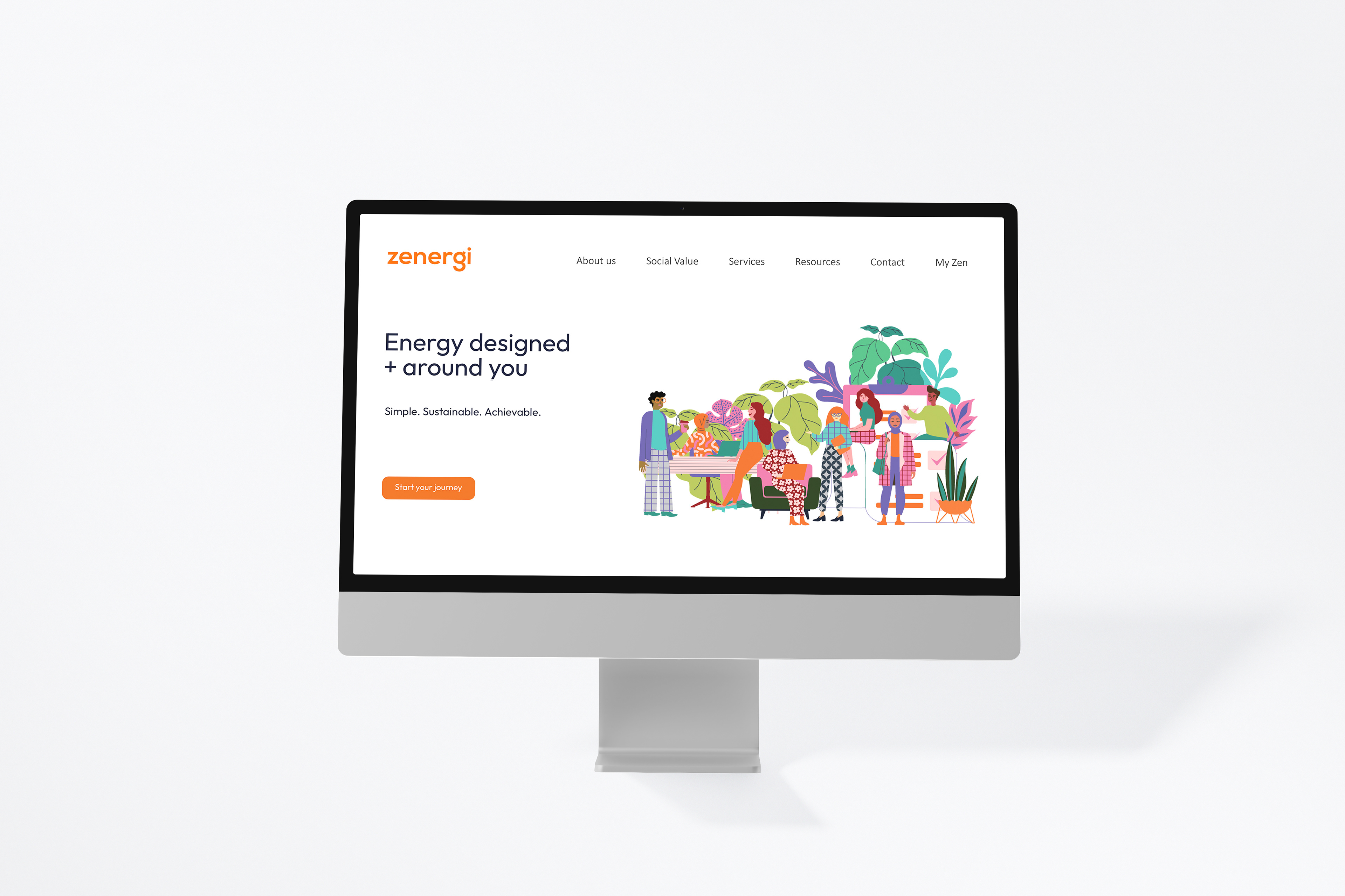
The final system expanded the palette while introducing clear guidance on colour hierarchy, combinations, and accessibility, with clear examples and rules to support different use cases This allowed for more effective use across illustrations, infographics, and marketing materials.