Pacific Content
Email Newsletter
-
Email Newsletter
-
Making regular content easier to read and reuse.
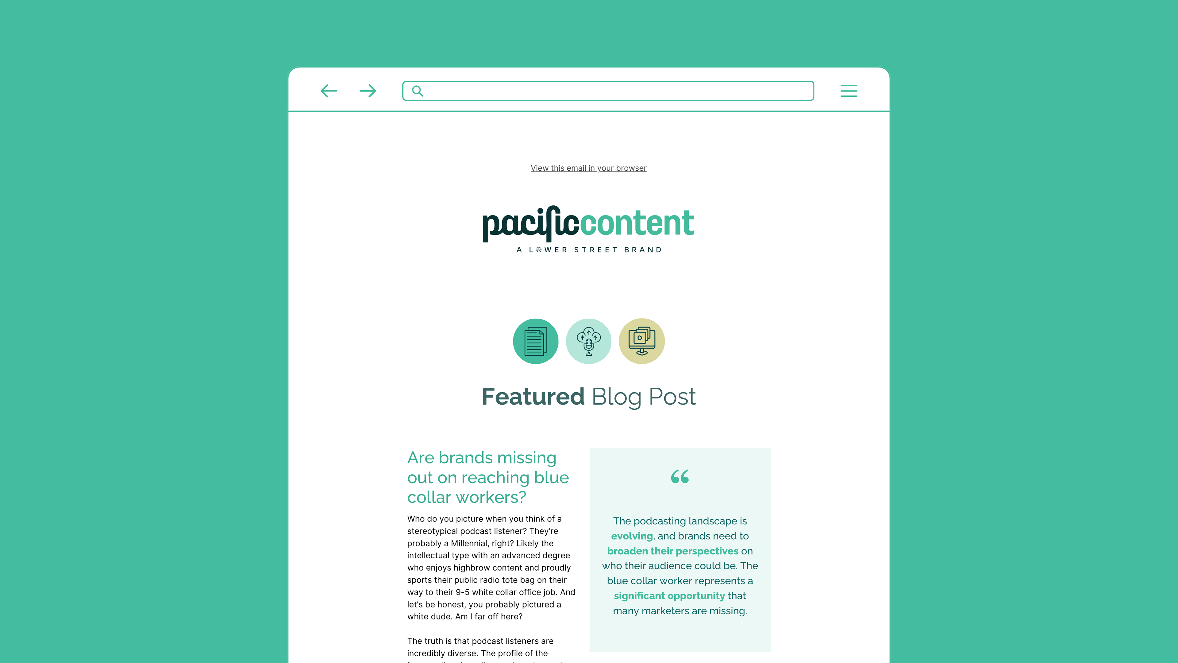
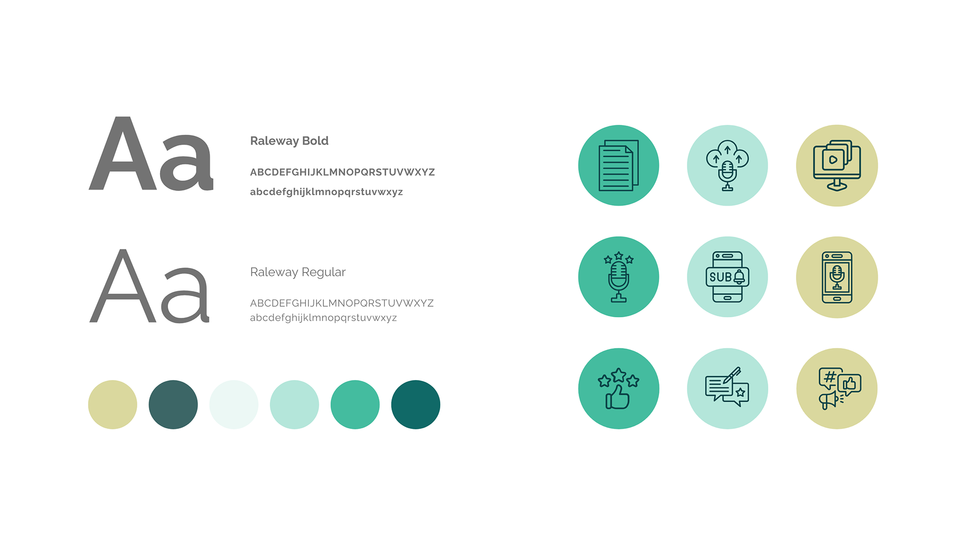
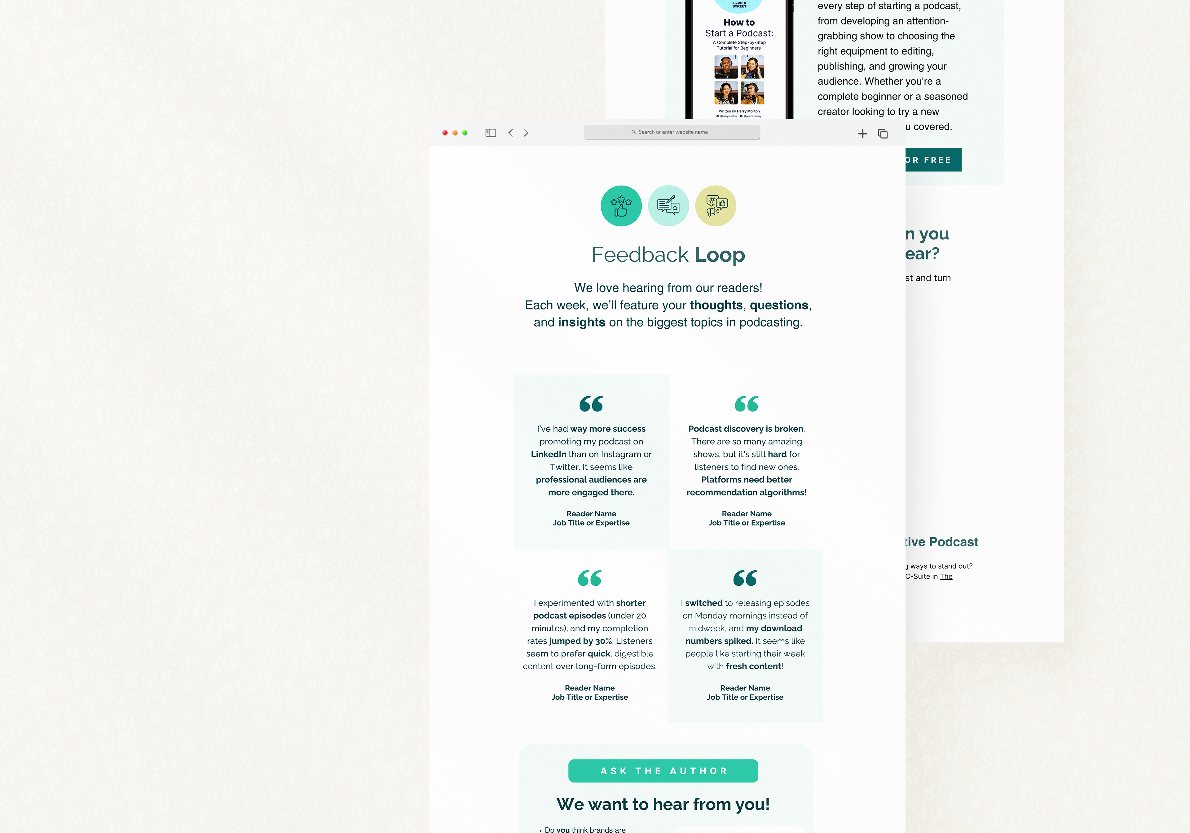
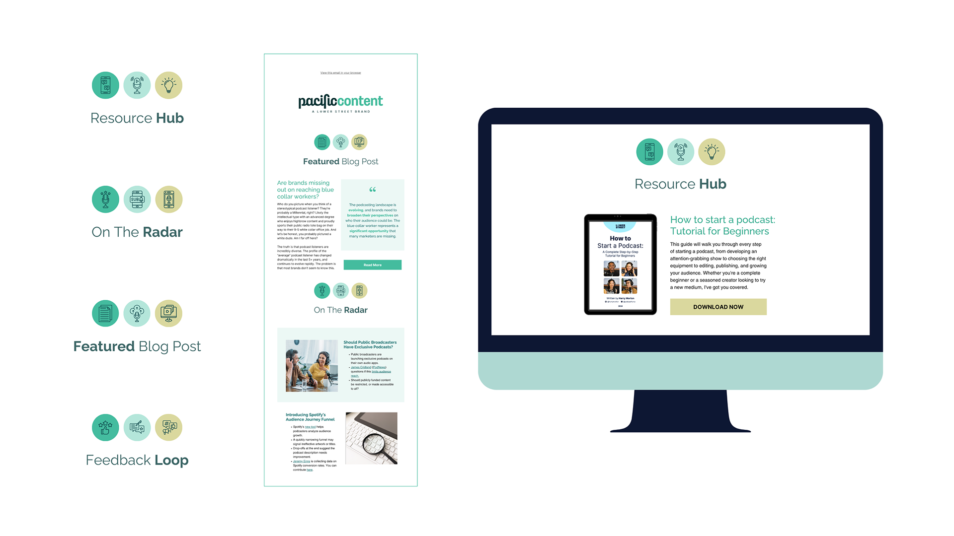
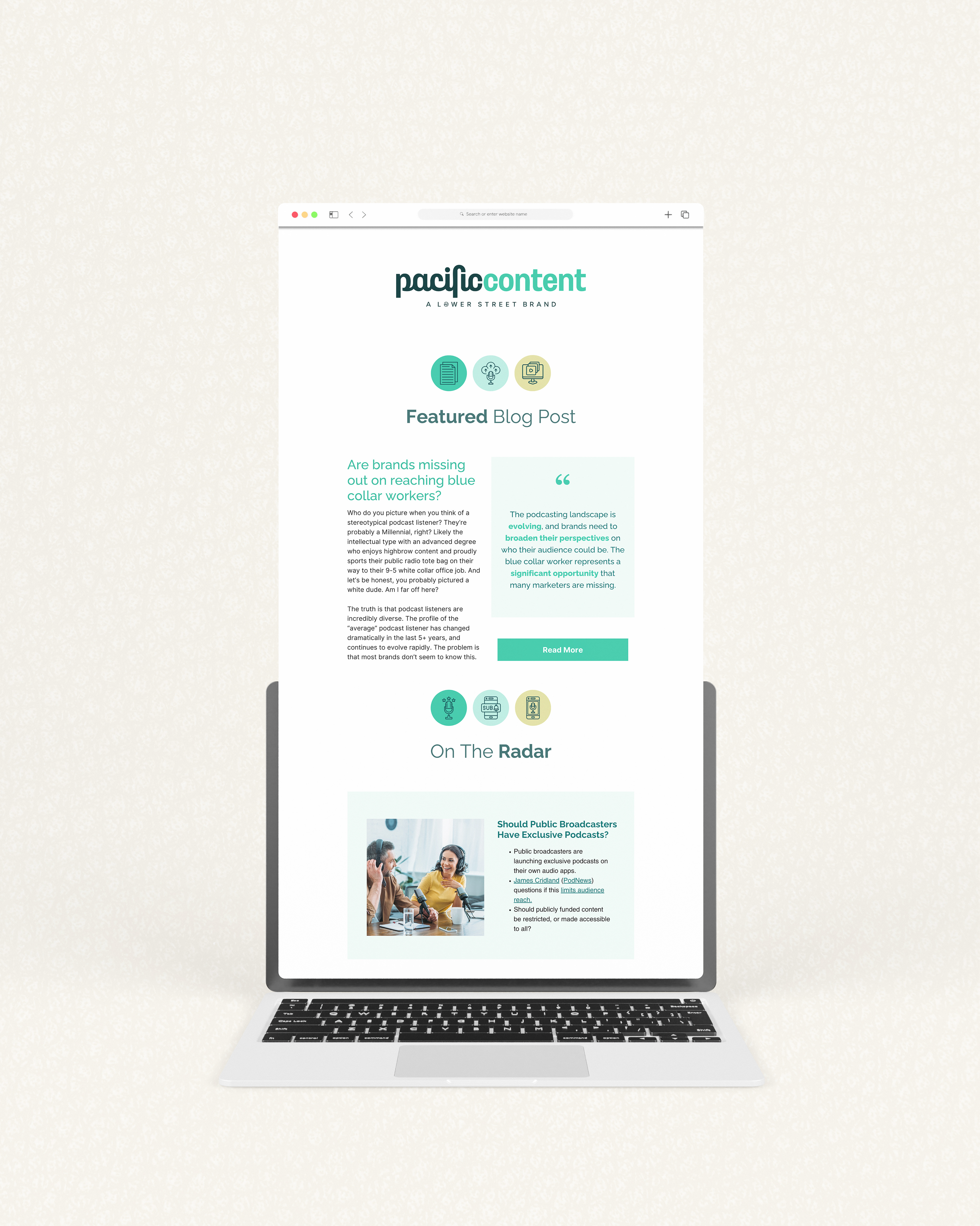
Following the development of new blog visuals, there was an opportunity to improve the design and structure of Pacific Content’s email newsletter. The existing format lacked consistency and didn’t fully support the clarity of the content. I redesigned the newsletter to create a more structured and readable layout, focusing on hierarchy, spacing, and flow. The aim was to make it easier for readers to scan content quickly while maintaining a clear visual identity.
The design aligns with the wider visual approach introduced across Pacific Content, ensuring consistency between blog and email outputs. Components such as new section headers were designed to be reusable, supporting a regular publishing cadence without requiring redesign each time. The updated design aligns with the wider visual approach across Pacific Content, creating a more consistent experience between channels.