
Lower Street
Website Design
-
Website Design
-
Improving how people move through and understand the site.


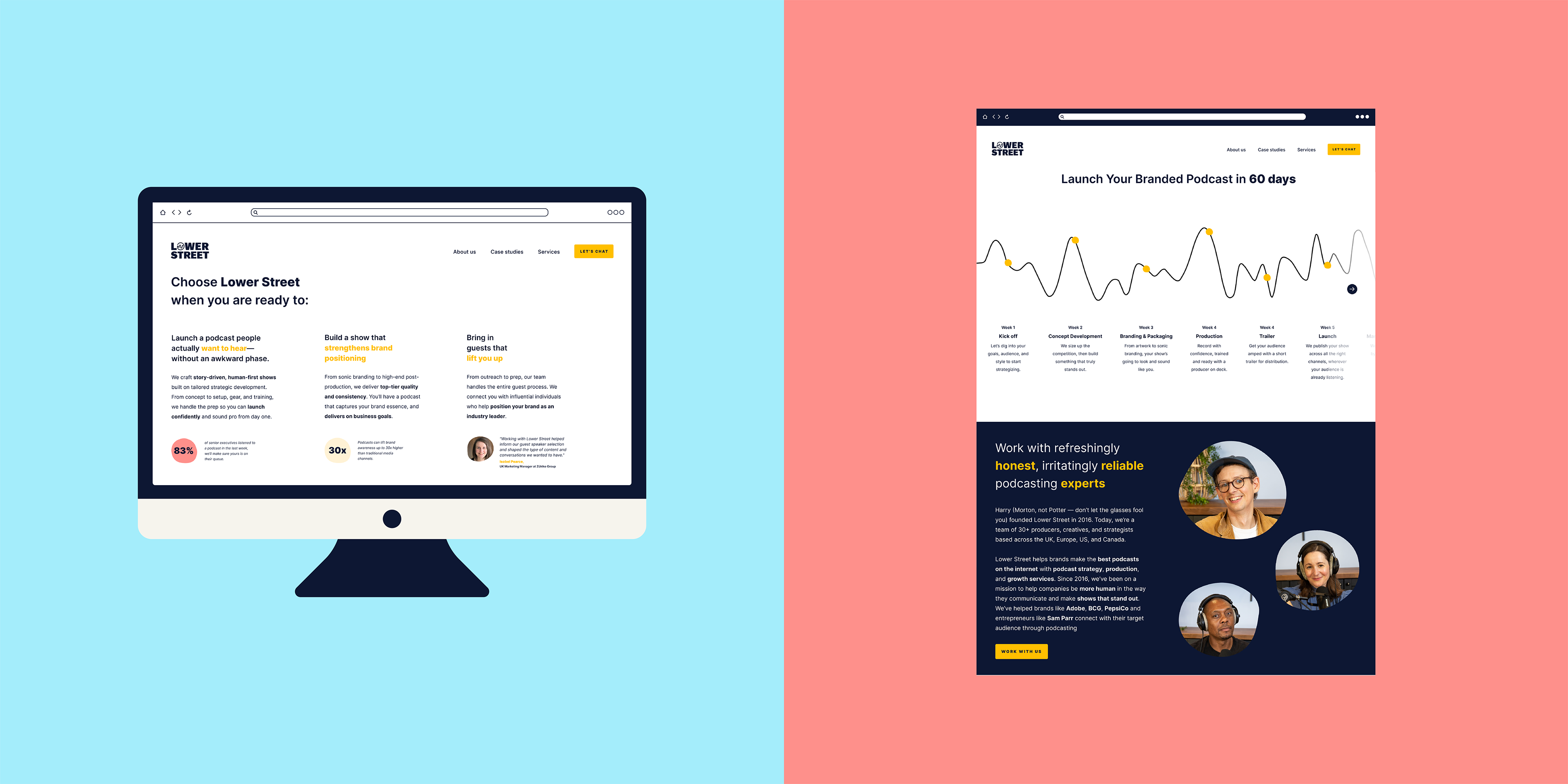


The Lower Street website was difficult to navigate. New services, case studies, tools and content had been added over time, resulting in inconsistencies in layout, hierarchy and user flow across key pages.
Working closely with the marketing manager and wider content team, I redesigned core marketing pages, landing pages and case studies in Figma. Through multiple rounds of feedback and iteration, we explored ways to improve content discovery, strengthen messaging and make long form pages easier to navigate.
A key focus was reducing cognitive load and helping users find relevant information more quickly. To support this, I introduced components such as carousels, expandable content sections and improved social proof placements, allowing pages to accommodate growing amounts of content without becoming overwhelming. I also refined page hierarchy, content structure and visual patterns to create a more cohesive experience across the site.
The redesigned homepage was tested through A/B experiments and achieved a 19% increase in conversion rate compared to the control. Early testing also showed the redesigned case studies page converting 19% higher than the previous version.
The result was a clearer, more scalable website that better supports both content marketing and business performance.
Working closely with the marketing manager and wider content team, I redesigned core marketing pages, landing pages and case studies in Figma. Through multiple rounds of feedback and iteration, we explored ways to improve content discovery, strengthen messaging and make long form pages easier to navigate.
A key focus was reducing cognitive load and helping users find relevant information more quickly. To support this, I introduced components such as carousels, expandable content sections and improved social proof placements, allowing pages to accommodate growing amounts of content without becoming overwhelming. I also refined page hierarchy, content structure and visual patterns to create a more cohesive experience across the site.
The redesigned homepage was tested through A/B experiments and achieved a 19% increase in conversion rate compared to the control. Early testing also showed the redesigned case studies page converting 19% higher than the previous version.
The result was a clearer, more scalable website that better supports both content marketing and business performance.