Florence Hills:
Tuscany Restored
-
Bringing two separate documents into a single, clearer story.
Tuscany Restored
-
Bringing two separate documents into a single, clearer story.
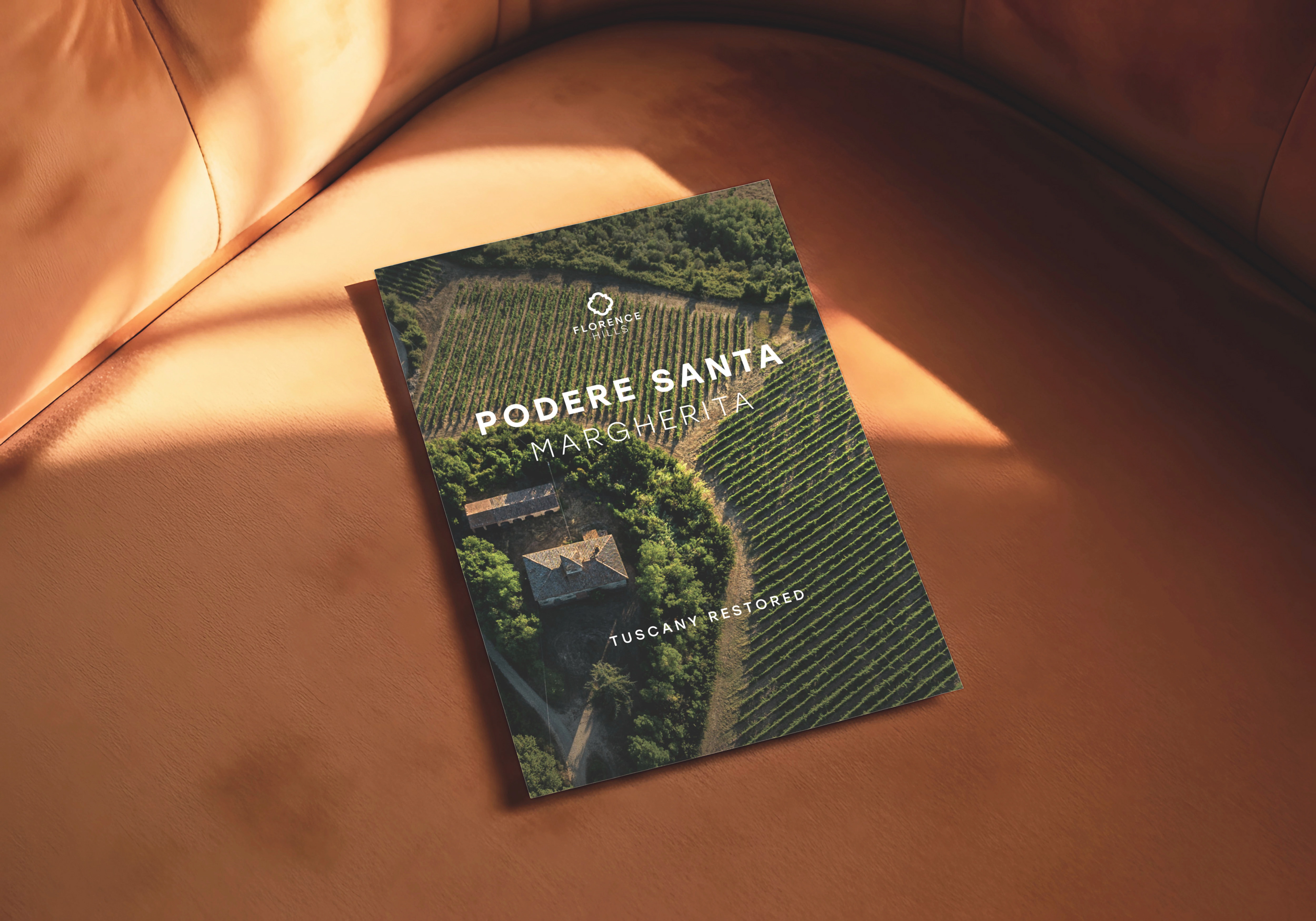
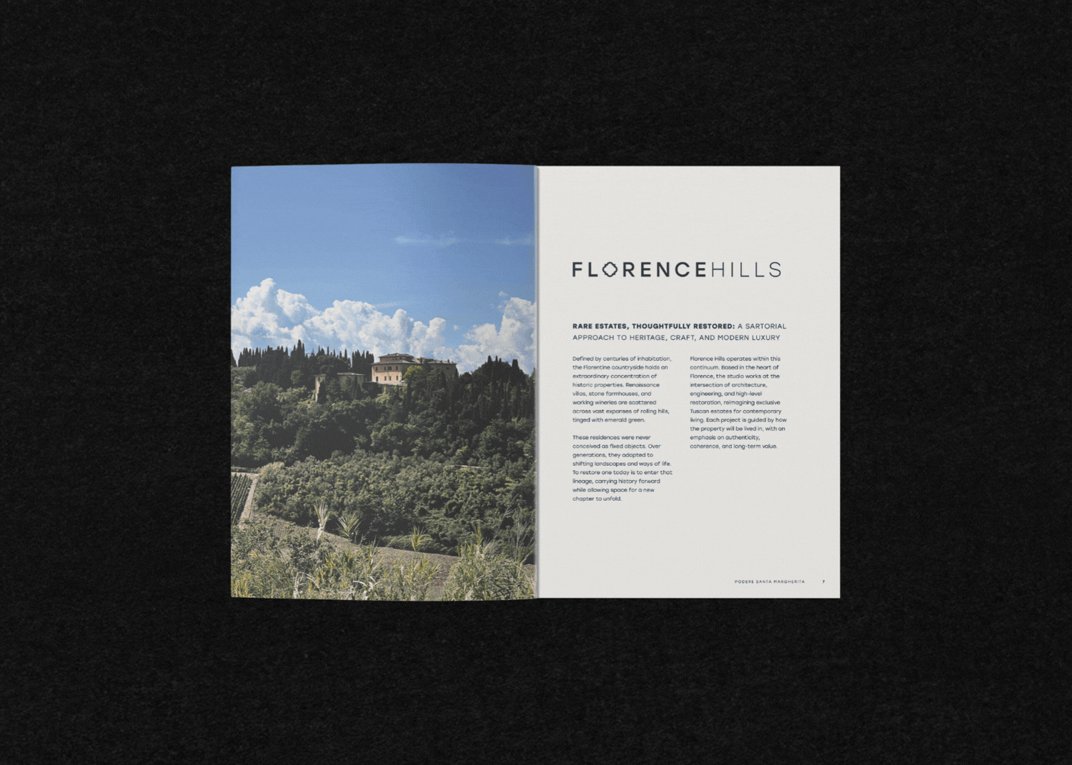
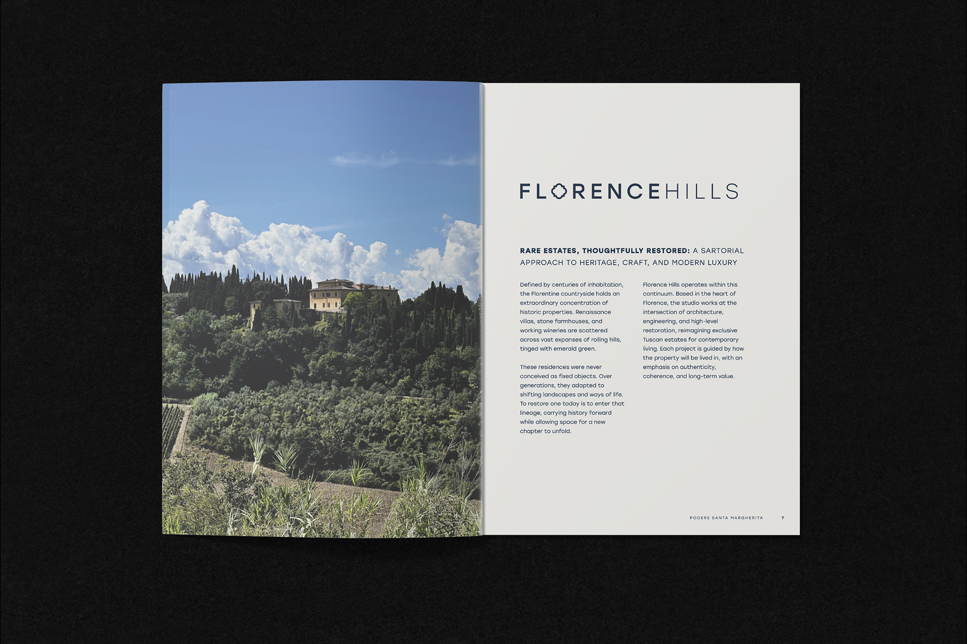
I was asked to consolidate two separate brochures for Florence Hills into a single document for Podere Santa Margherita. Both files covered similar content but differed in structure, tone, and visual style, which made the overall experience feel fragmented.
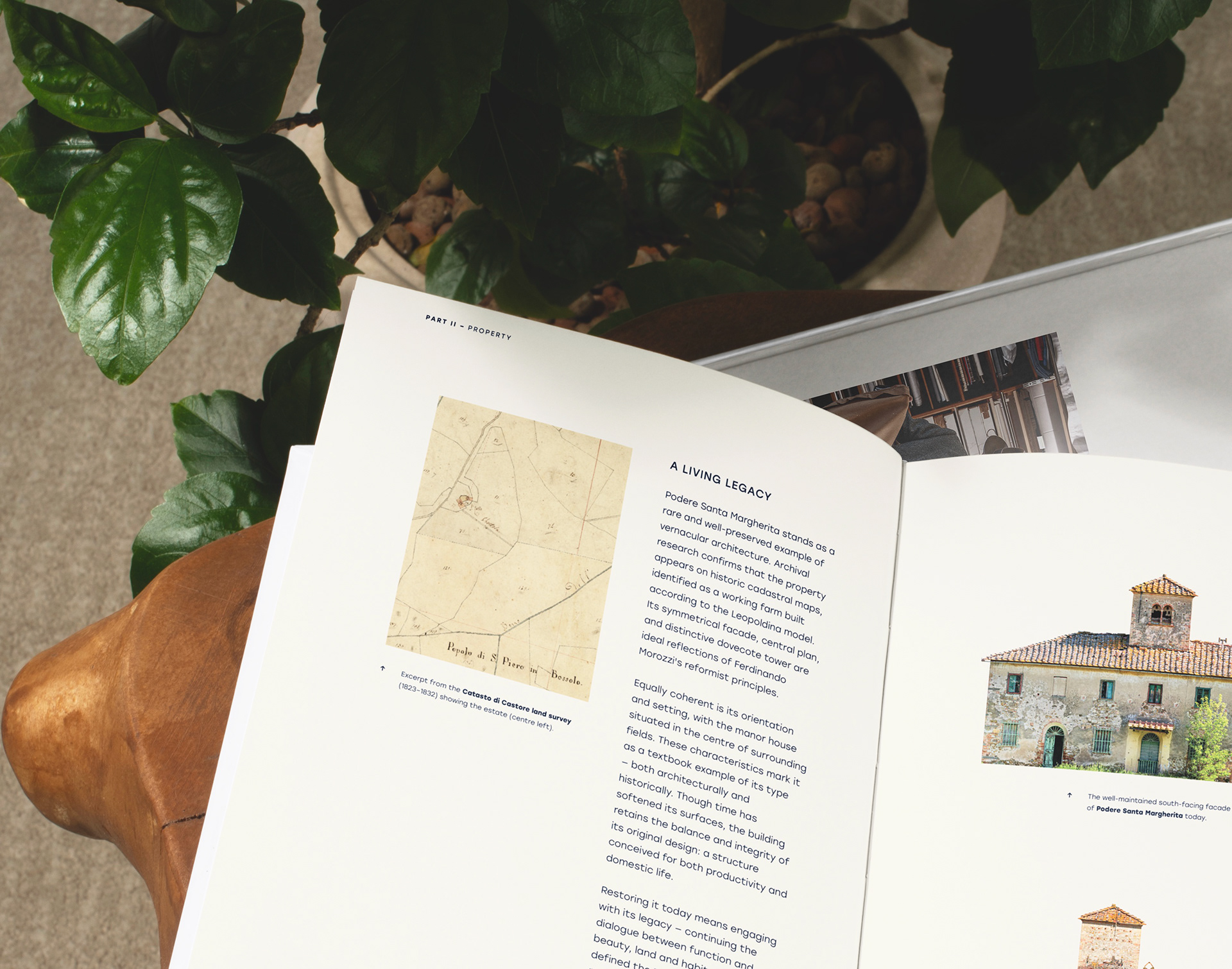
My approach focused on creating a clearer narrative and a more property led identity. I reworked the cover hierarchy to centre the estate, introduced a contents page and restructured sections to improve flow and remove repetition. Alongside this, I refined typography and layout to improve readability, increasing body copy size and moving away from justified text to create more breathing room. Image selection and placement were also revisited to better support the pacing of the document.
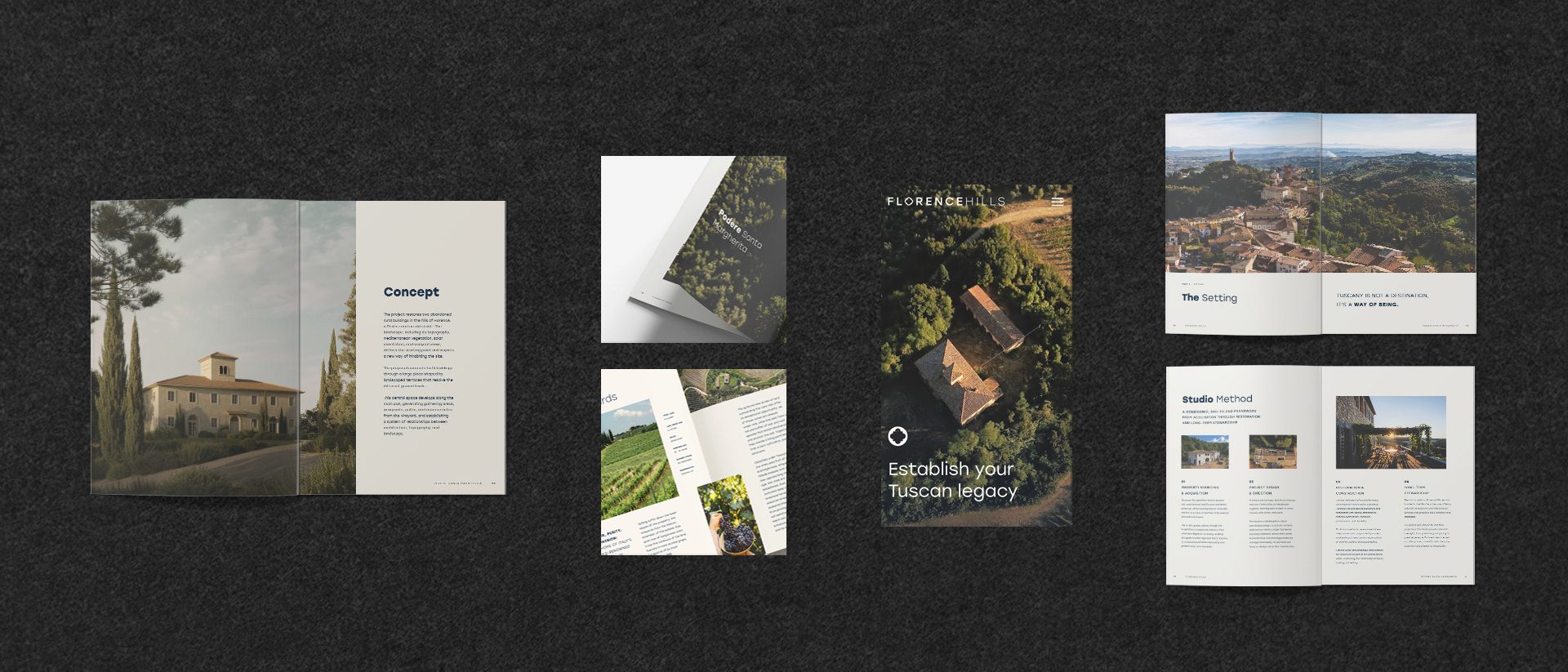
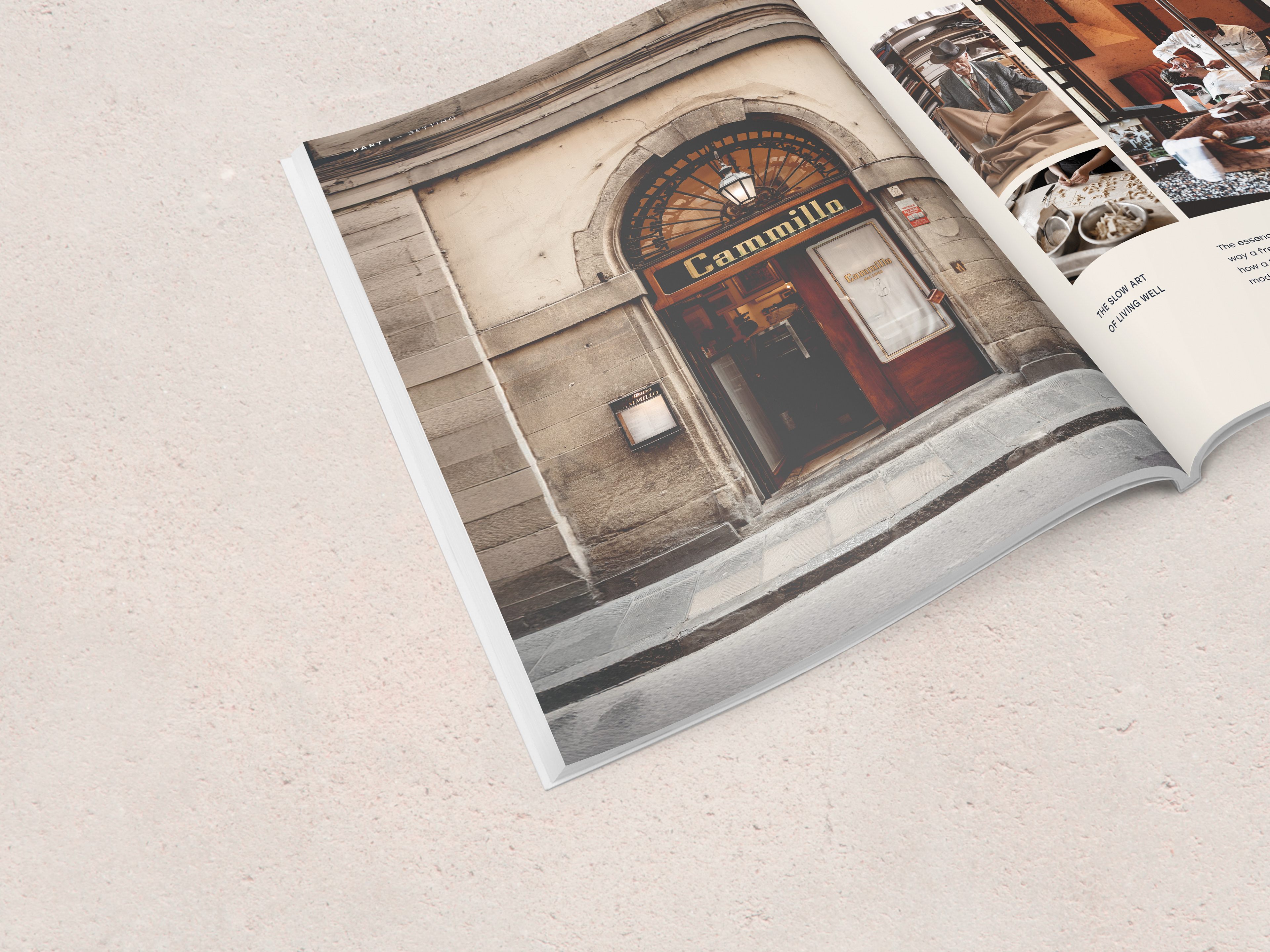
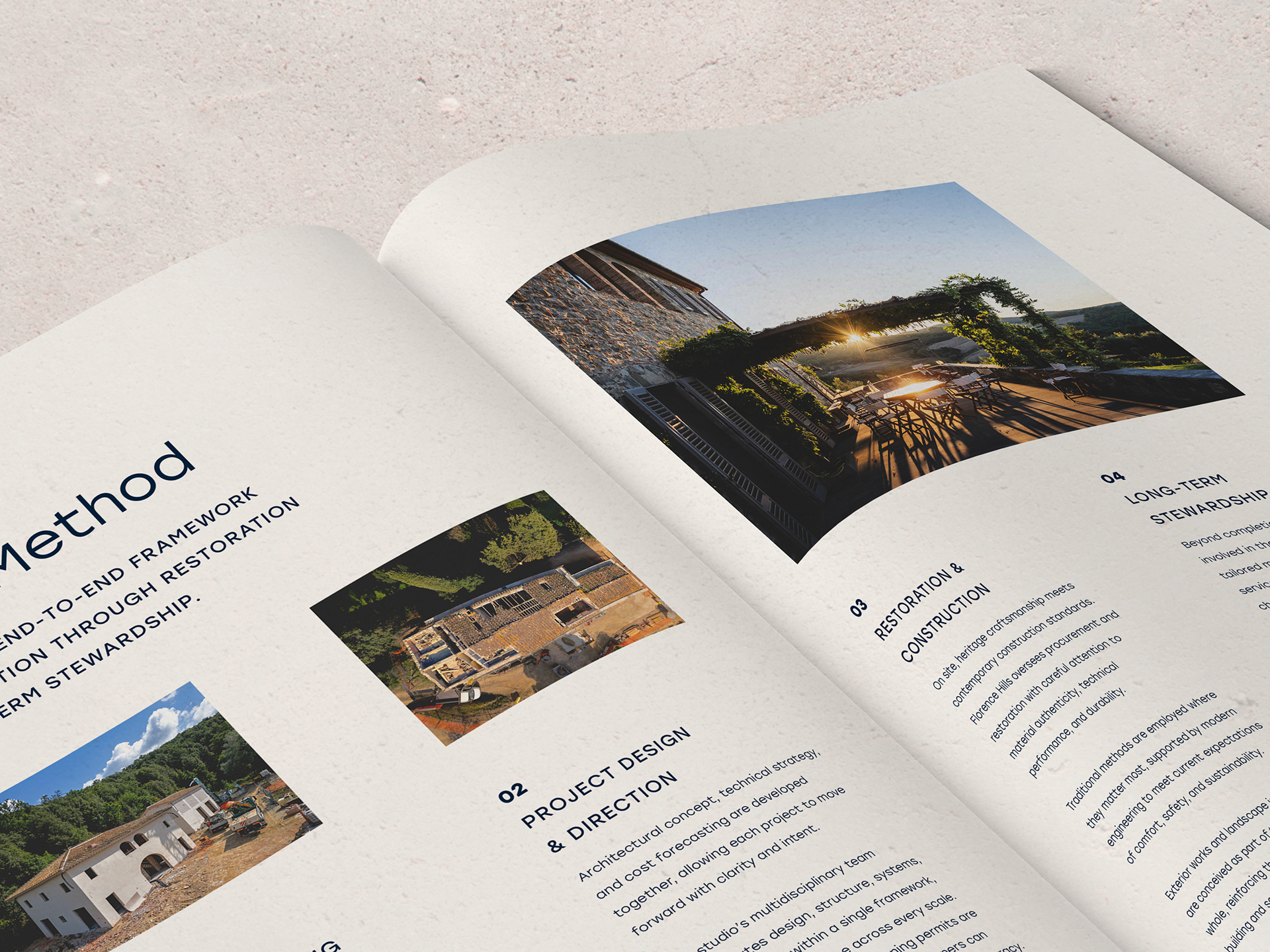
With the structure in place, I developed two layout directions to test how the content could best be presented. One stayed closer to the original format, while the other prioritised space, pacing and a more architectural feel, particularly across floor plans and technical content.
I also refined the visual treatment of imagery, adjusting tone and saturation to create a softer, more consistent finish across assets sourced from different documents. This helped unify the overall look and better reflect the brand’s luxury positioning. The final outcome is a 64 page, print ready brochure that feels cohesive, balanced and easier to navigate, supporting both client presentations and wider marketing use.
My approach focused on creating a clearer narrative and a more property led identity. I reworked the cover hierarchy to centre the estate, introduced a contents page and restructured sections to improve flow and remove repetition. Alongside this, I refined typography and layout to improve readability, increasing body copy size and moving away from justified text to create more breathing room. Image selection and placement were also revisited to better support the pacing of the document.
With the structure in place, I developed two layout directions to test how the content could best be presented. One stayed closer to the original format, while the other prioritised space, pacing and a more architectural feel, particularly across floor plans and technical content.
I also refined the visual treatment of imagery, adjusting tone and saturation to create a softer, more consistent finish across assets sourced from different documents. This helped unify the overall look and better reflect the brand’s luxury positioning. The final outcome is a 64 page, print ready brochure that feels cohesive, balanced and easier to navigate, supporting both client presentations and wider marketing use.