
Calico Row
Brand System
-
A visual identity shaped by heritage and textiles.
Brand System
-
A visual identity shaped by heritage and textiles.

Calico Row is a sustainability led education platform currently in development, founded by a fashion professional transitioning into education after running two successful brands. Now teaching at FE level and completing a Master’s, the founder is addressing a clear gap in how sustainability is taught in fashion and textiles.
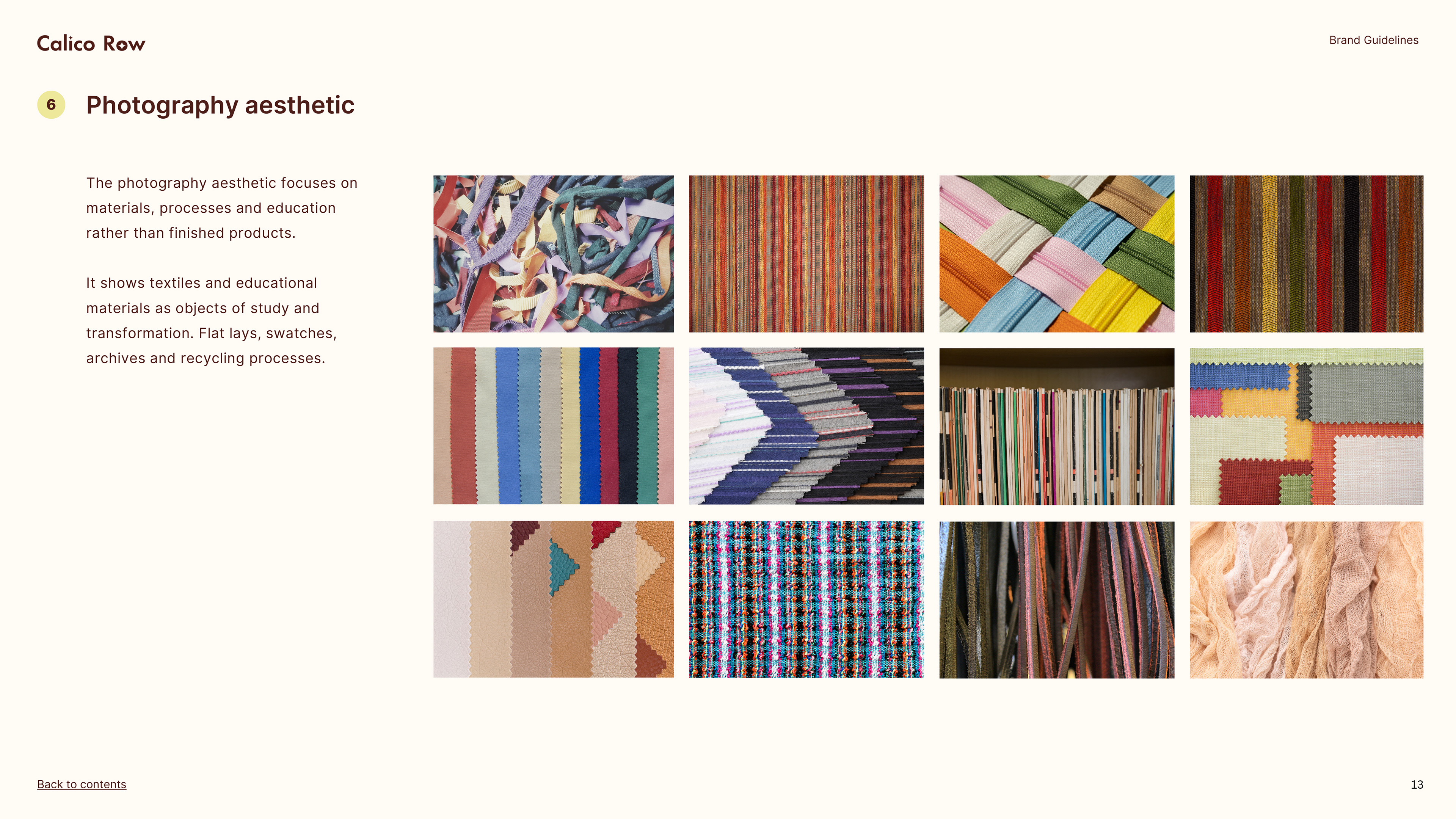
The challenge was to translate complex, often inaccessible subject matter into a visual system that feels clear, engaging, and non-preachy. The identity draws on the material and historical origins of calico — referencing its roots in Calicut, India, alongside the rounded, flowing qualities of Malayalam letterforms — combined with coastal colour influences and textile-driven visual cues.
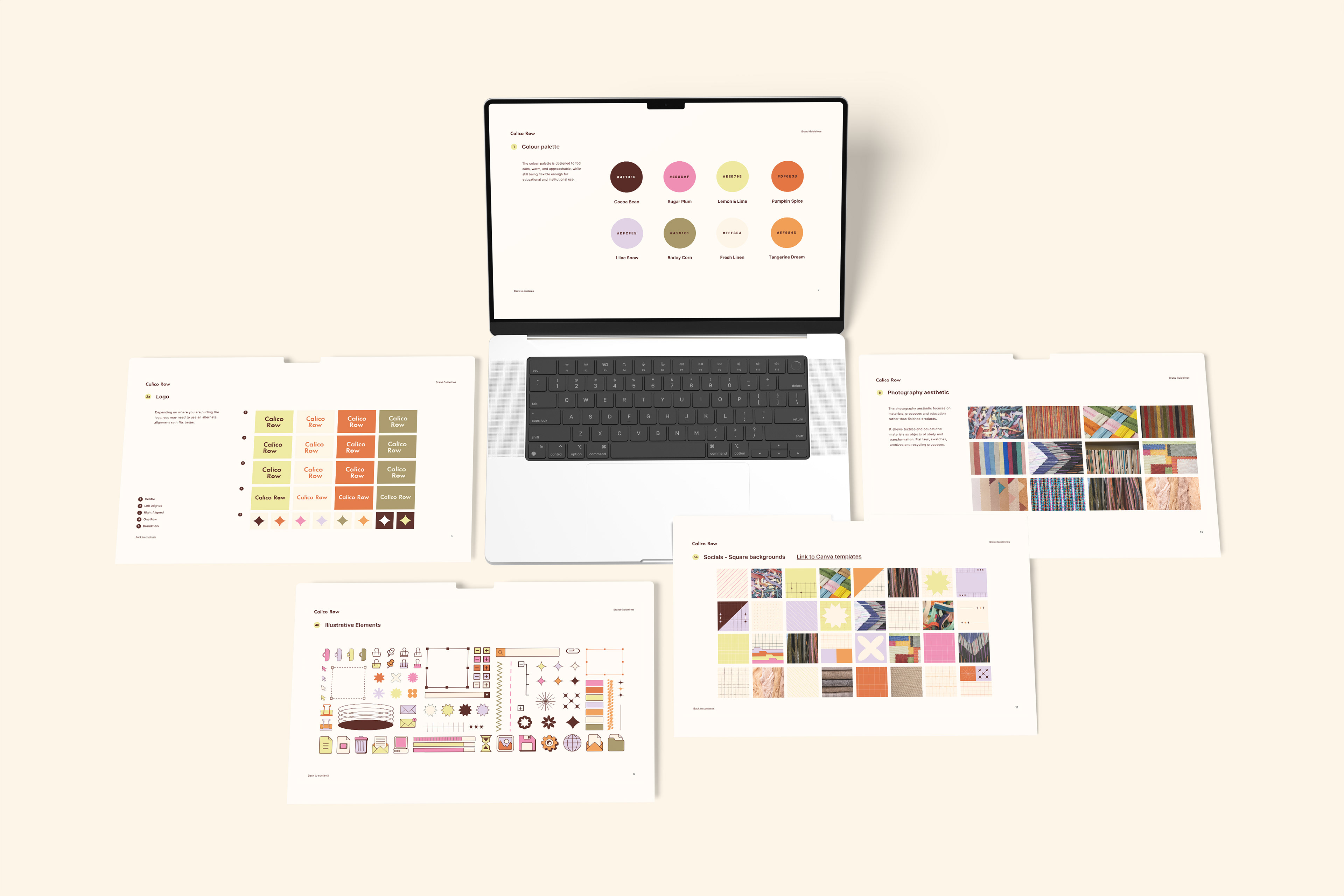
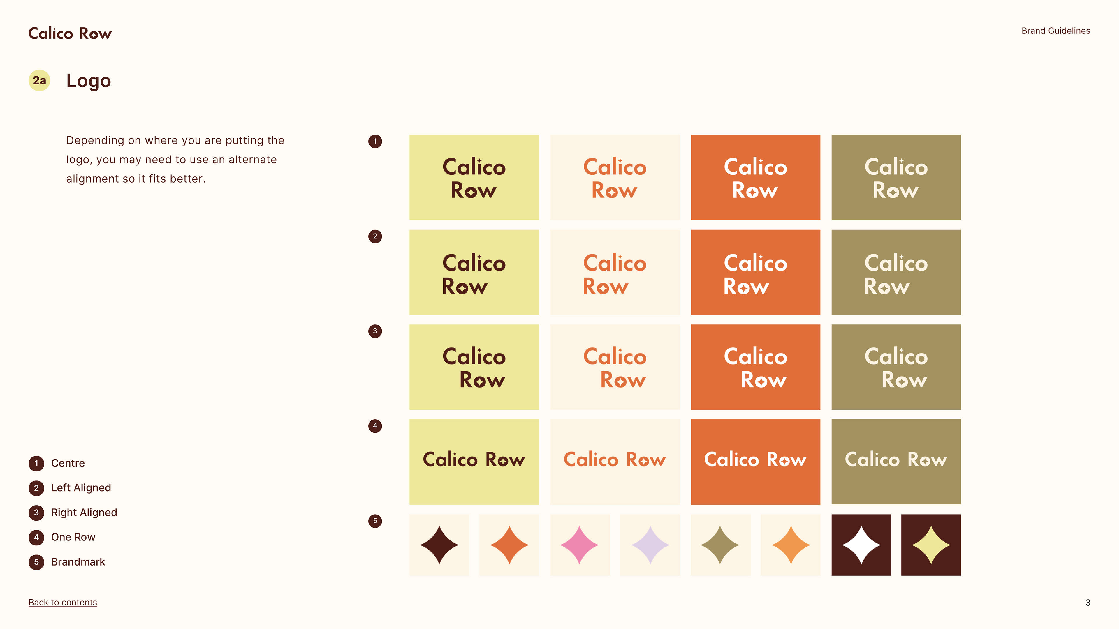
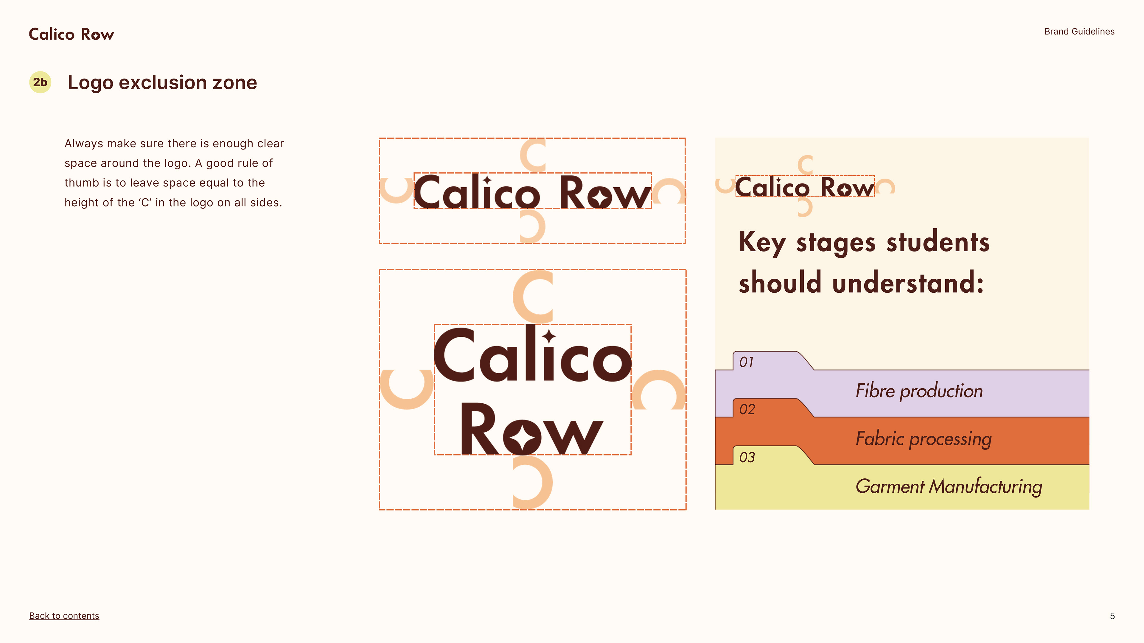
Multiple logo configurations were developed to support different use cases, from structured educational materials to more expressive social content. A considered exclusion zone and alignment system ensure consistency across formats, particularly when working within tight layouts such as worksheets or slides. The brand mark extends this thinking, acting as a flexible graphic device that can be used independently or integrated into layouts. This approach allows the identity to scale across both formal and informal contexts without losing coherence.
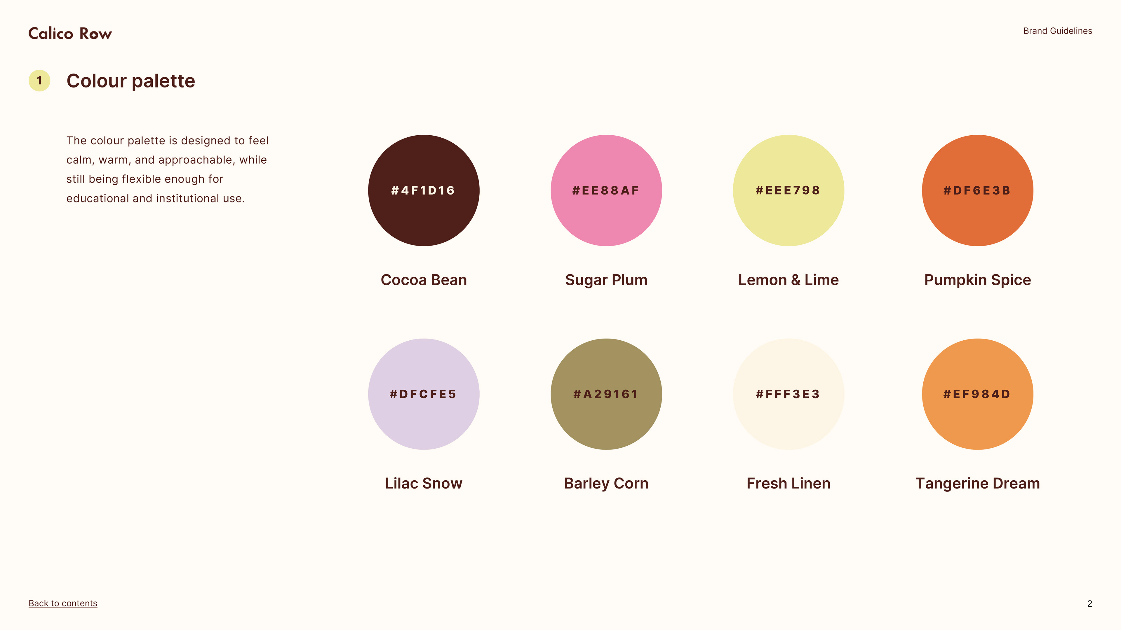
The colour palette was informed by the material and geographic origins of calico, drawing from sun-washed coastal tones, natural fibres, and textile dyes. Rather than relying on typical “eco” greens, the palette balances earthy neutrals with brighter accents to create warmth and approachability.
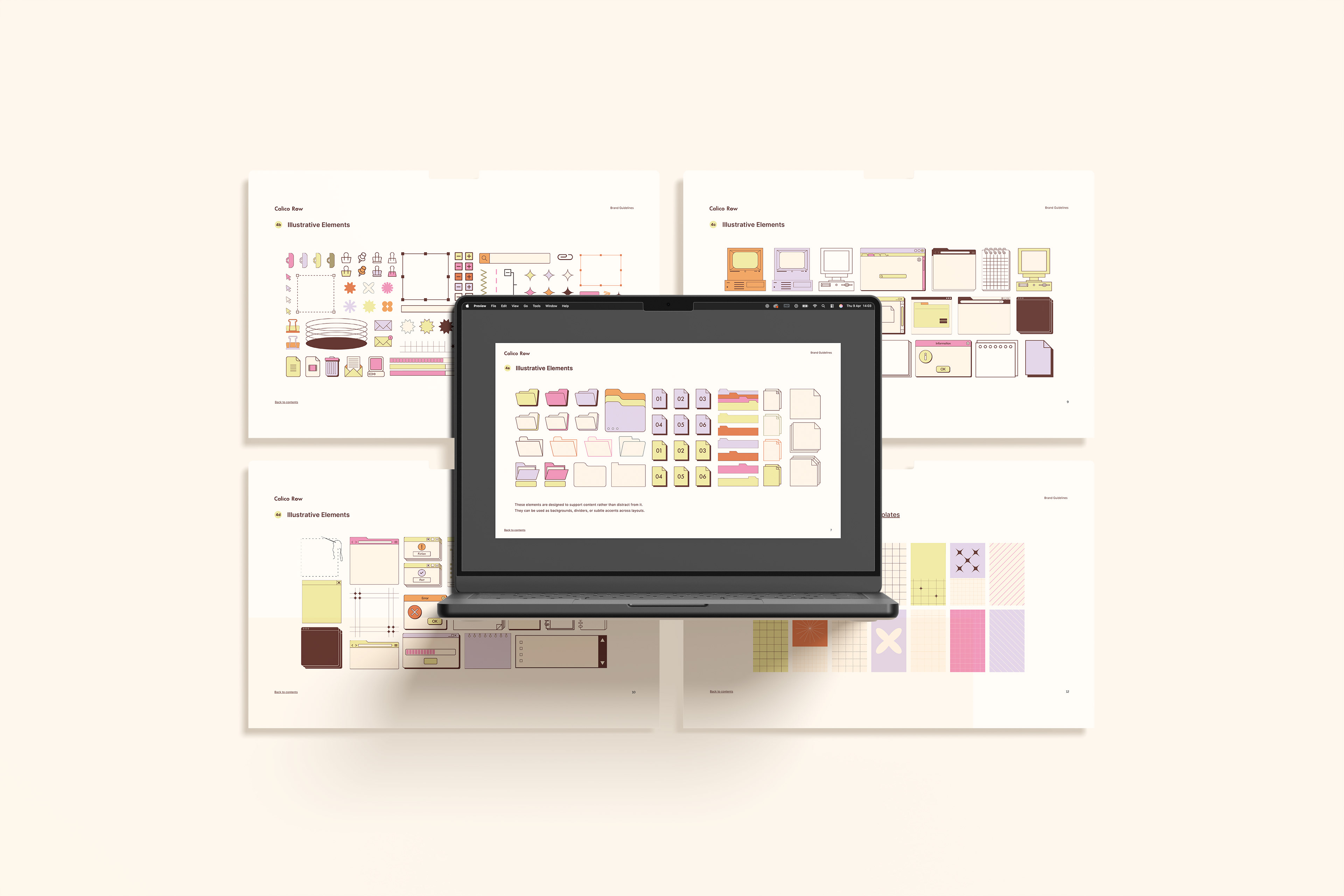
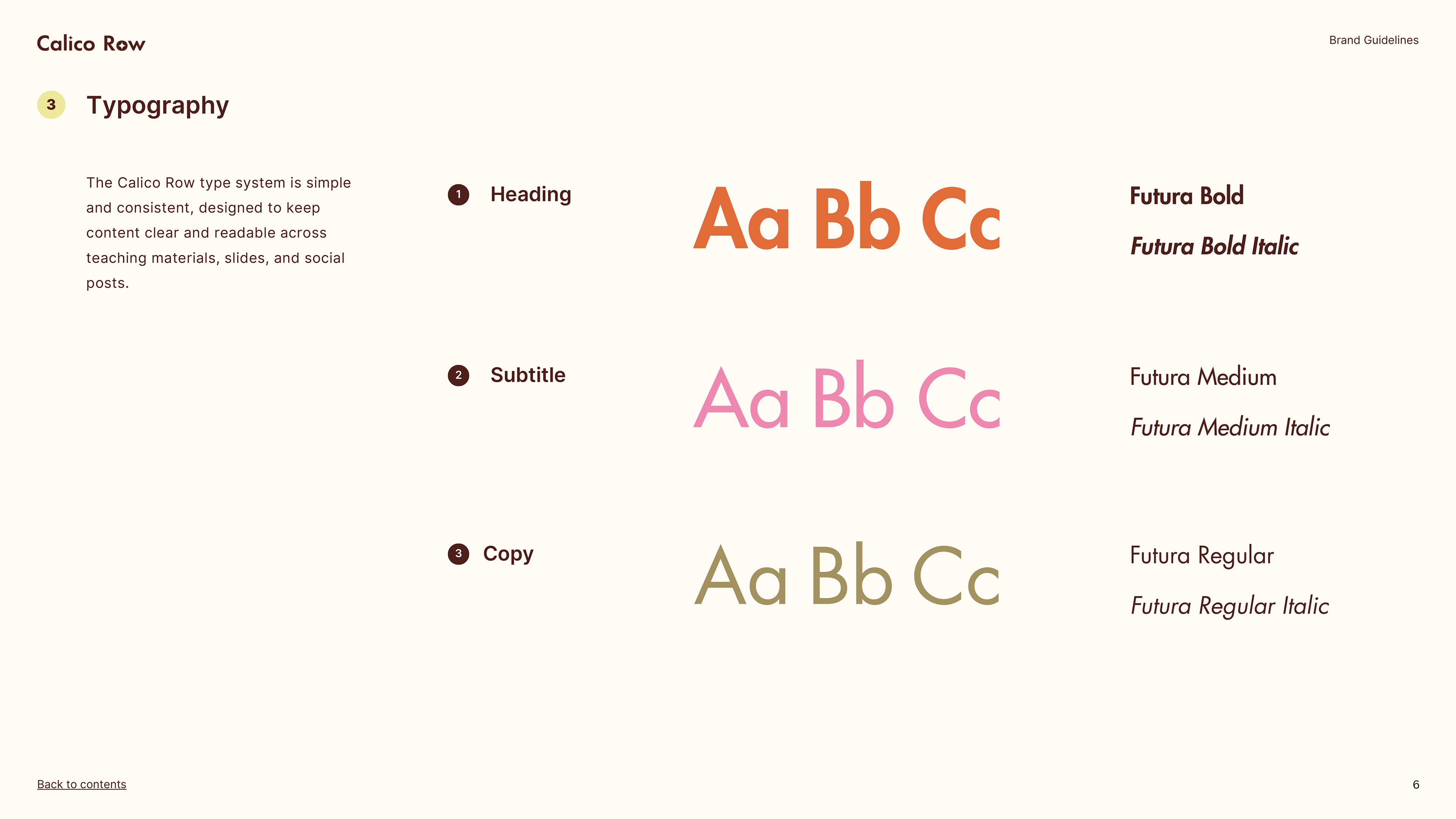
Typography is structured but not overly academic, supporting readability across educational formats and is paired with a modular visual language built from grids, patterns and illustrative elements that echo textile systems and construction processes. Together, these components create a system that can flex between calm, structured teaching materials and more expressive, engaging social content, maintaining consistency while allowing variation.
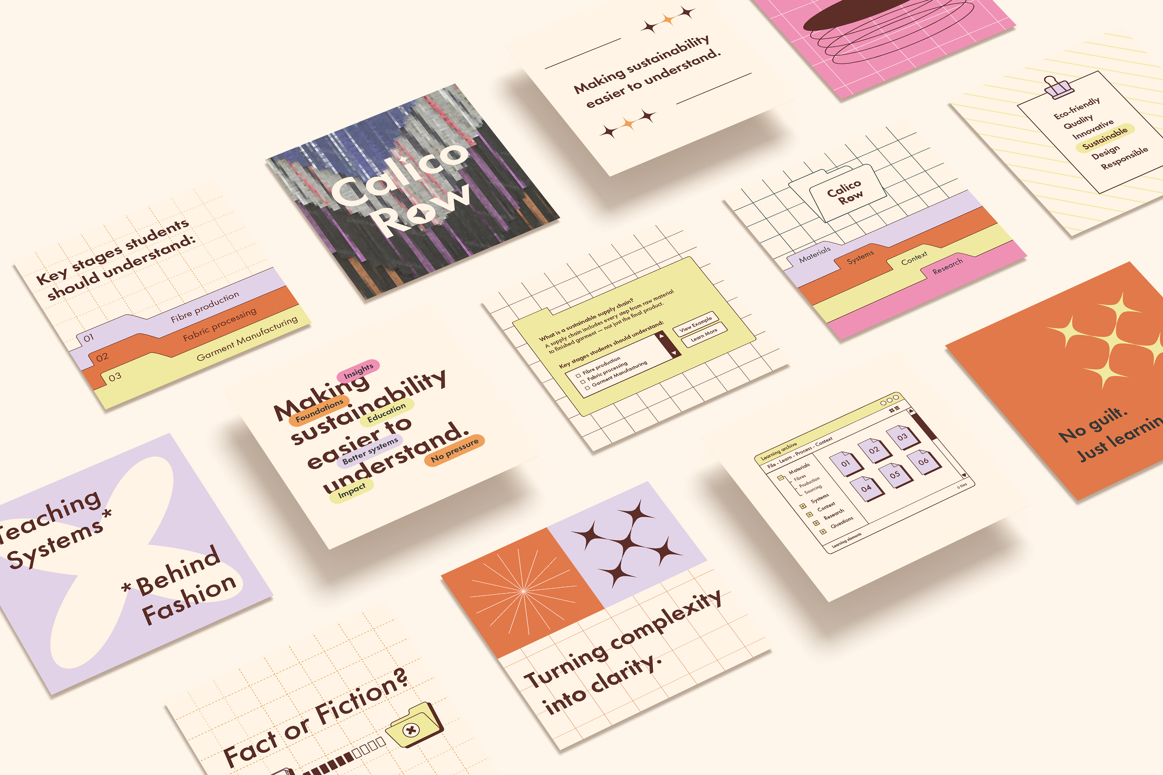
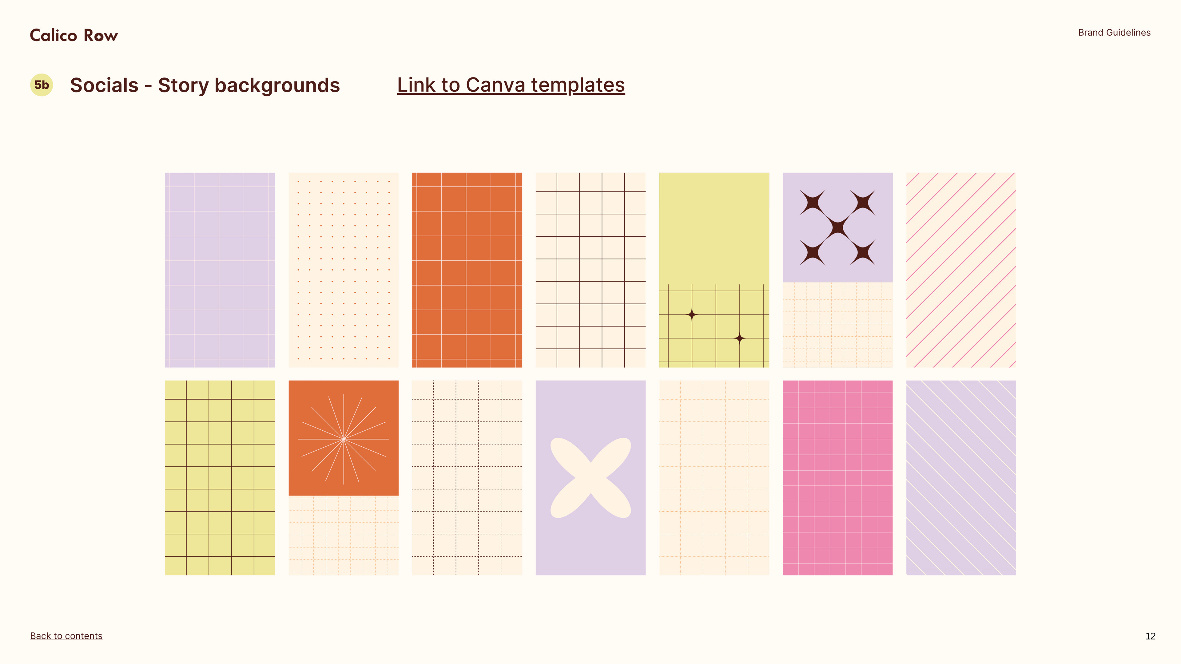
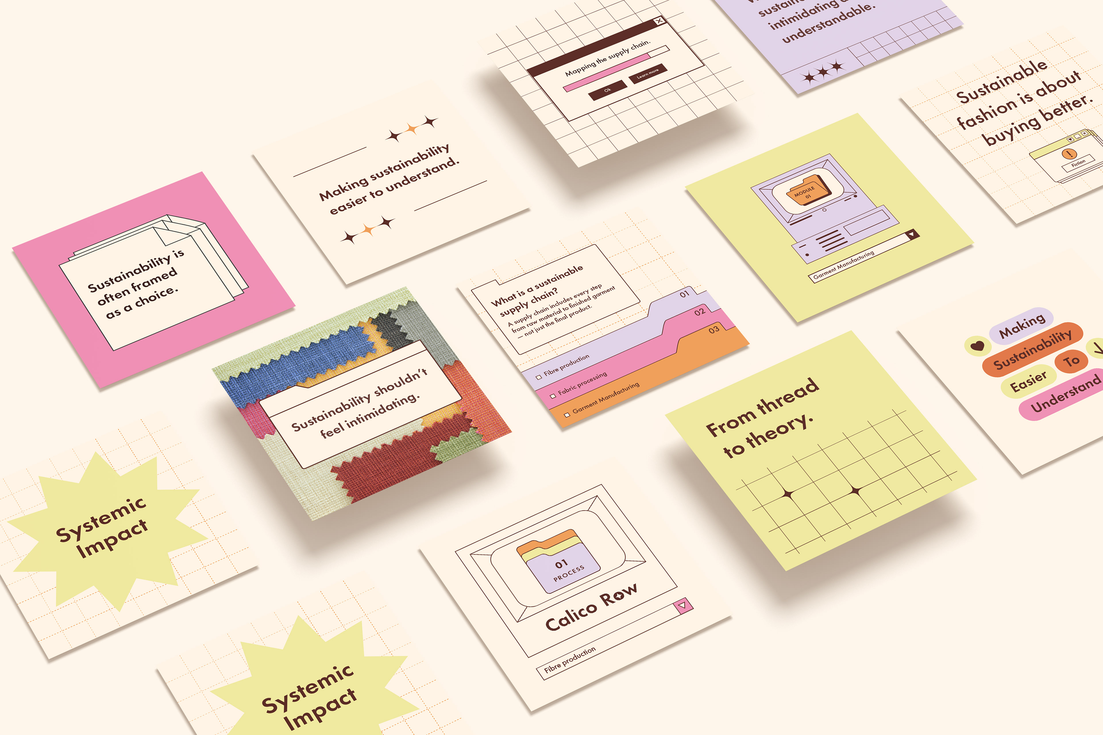
A key part of the project was designing for real world use, not just visual output. Alongside the brand guidelines, I developed a series of reusable templates for social content, teaching materials, and workshop contexts. These templates were designed to support different types of educational content, from statements and principles, to process explanations and classroom insights. The system allows content to be produced quickly while maintaining visual consistency, particularly important for a solo founder working across teaching and content creation.
These templates were designed to support different types of educational content, from statements and principles, to process explanations and classroom insights. The system allows content to be produced quickly while maintaining visual consistency, particularly important for a solo founder working across teaching and content creation. The layouts are intentionally simple and modular, ensuring they can be adapted across formats without requiring constant redesign. This supports long term scalability as the platform evolves.
The challenge was to translate complex, often inaccessible subject matter into a visual system that feels clear, engaging, and non-preachy. The identity draws on the material and historical origins of calico — referencing its roots in Calicut, India, alongside the rounded, flowing qualities of Malayalam letterforms — combined with coastal colour influences and textile-driven visual cues.
Multiple logo configurations were developed to support different use cases, from structured educational materials to more expressive social content. A considered exclusion zone and alignment system ensure consistency across formats, particularly when working within tight layouts such as worksheets or slides. The brand mark extends this thinking, acting as a flexible graphic device that can be used independently or integrated into layouts. This approach allows the identity to scale across both formal and informal contexts without losing coherence.
The colour palette was informed by the material and geographic origins of calico, drawing from sun-washed coastal tones, natural fibres, and textile dyes. Rather than relying on typical “eco” greens, the palette balances earthy neutrals with brighter accents to create warmth and approachability.
Typography is structured but not overly academic, supporting readability across educational formats and is paired with a modular visual language built from grids, patterns and illustrative elements that echo textile systems and construction processes. Together, these components create a system that can flex between calm, structured teaching materials and more expressive, engaging social content, maintaining consistency while allowing variation.
A key part of the project was designing for real world use, not just visual output. Alongside the brand guidelines, I developed a series of reusable templates for social content, teaching materials, and workshop contexts. These templates were designed to support different types of educational content, from statements and principles, to process explanations and classroom insights. The system allows content to be produced quickly while maintaining visual consistency, particularly important for a solo founder working across teaching and content creation.
These templates were designed to support different types of educational content, from statements and principles, to process explanations and classroom insights. The system allows content to be produced quickly while maintaining visual consistency, particularly important for a solo founder working across teaching and content creation. The layouts are intentionally simple and modular, ensuring they can be adapted across formats without requiring constant redesign. This supports long term scalability as the platform evolves.